|
Written by Matt Lackey Picking a font that reads well, looks great, and fits the overall feel you are looking to create can be a difficult decision to make. There are many factors that will influence your decision like attended audience, the medium it is presented on, and who the product is being created for just to name a few. Often times you can be tempted to go with the default font of the software you are using, but your final product could be missing out on getting it’s true message across. A lot of times we tend to go with a list of fonts we know we like to work it, but when you find yourself wanting to explore other fonts it can be difficult to even know where to begin. One great place to start exploring is on fontmap.ideao.com. 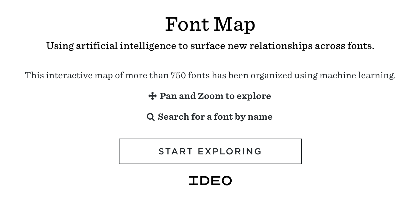 Kevin Ho, a software designer and project lead for IDEO created this font map by first creating images of each font to then be used in a network called VGG16 to generate a list of numbers to be associated with each font. Then to represent the data spatially, x and y points were created using T-SNE, an algorithm for taking large vectors and compressing them into a 2-D plane. What is created is a grouping of fonts that are similar to one another. 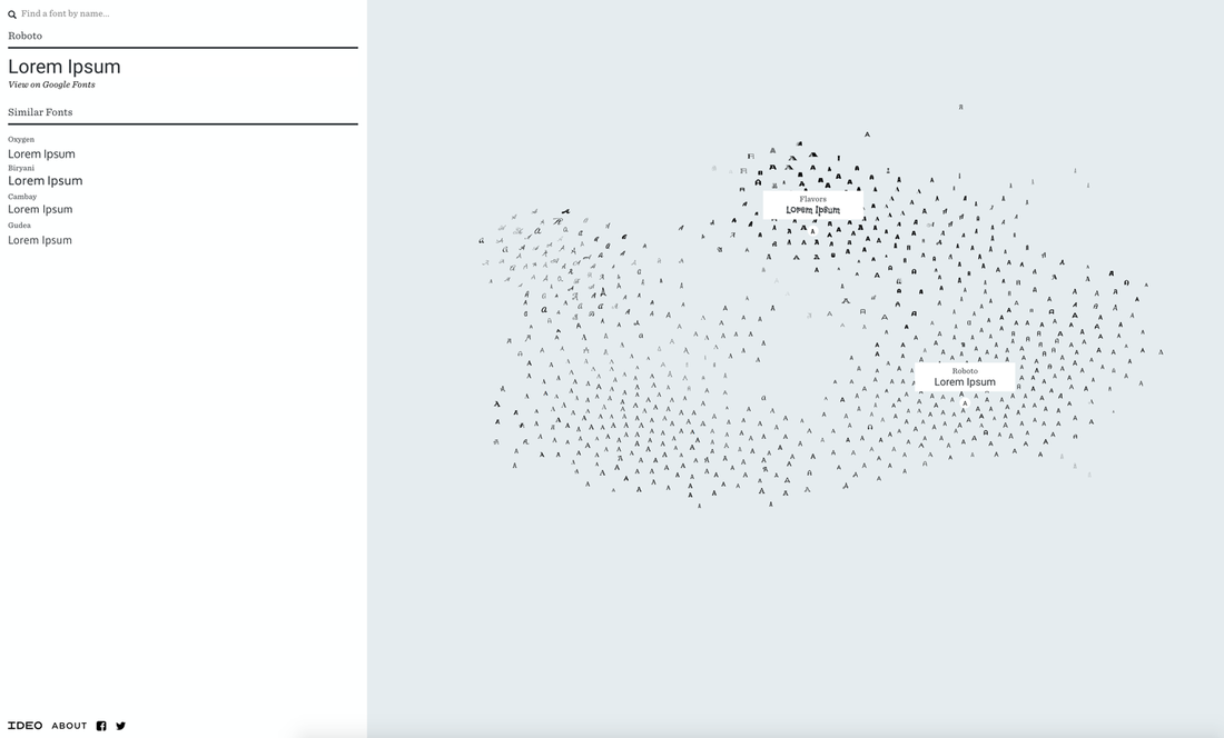 You can zoom in and out and scroll around easily searching through fonts. Holding your cursor over a letter will display the fonts name and show an example of the font in use. Double clicking on a font will display more details on the left side of the screen. A list of similar fonts are displayed and each font has a link View on Google Fonts, which links you to even more information about that font.
This is very useful when you are searching for a new font to try on your next project. This display feels easier to search through grouping the fonts in a way the makes sense visually, as opposed to being listed alphabetically on a single drop down menu. The interactive ability of this map makes picking a font more entertaining as well. Now this just needs to be expanded beyond google fonts and then it will be a really great tool!
3 Comments
Jay Yungerman
5/23/2018 10:34:52 am
This is great. I always try to use atypical fonts and I never know where to find them outside of whatever application I'm using. I'm definitely going to add this to my GIS bookmarks (I know it's not just for GIS). 6/12/2018 08:38:16 pm
Thank you for choosing this topic, I think most of us need to know how to get and use new fonts especially when we start design our maps.
TJ Hutchisson
6/12/2018 11:38:44 pm
How cool?! I often feel obsessive about fonts, switching back & forth, back & forth (even in word documents sometimes). I love the idea of having all the fonts in front of you, side by side. I will definitely be using this in the future. Leave a Reply. |
AuthorBlog posts are written by students in the Interactive Map Design course at Portland Community College. Archives
June 2018
Categories |
 RSS Feed