|
Written by Nicole Elsmore Stumbling upon the National Geographic’s MapMaker Interactive seemed like a fortunate thing, and inside I squealed with glee. The splash screen promised country facts, coordinate data, and customizable map features. 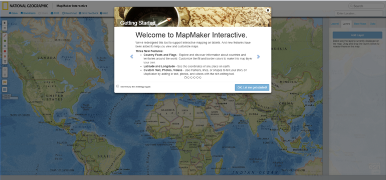 Unfortunately, my experience only went downhill from here. Behind the splash screen stood the ominous, hideous transverse Mercator world projection. The program allowed me to zoom out and scroll through the infinite world and also allowed me to zoom in to the point of the map breaking into gray tiles reading “Map Data Not Yet Available”. Although the Nat Geo data layers displayed consistently throughout the infinite world, any data I added stuck to only one iteration. 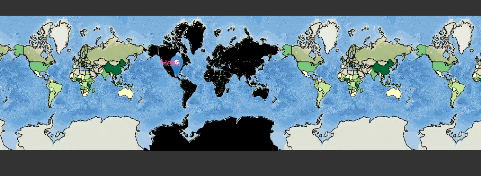 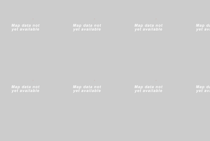 The datasets provided by Nat Geo were viscerally the most interesting aspect of the MapMaker. They provided a few dozen datasets, with everything from “Sweet Potato Production” to “Big Cat Territories”. While these datasets were inherently interesting there wasn’t much I could do with them. Altering the transparency of the layers was the only “analysis” tool available. A promising tab labeled “data” on the right-side menu remained blank in spite of my desperate poking and prodding and this tab’s lack of functionality proved the biggest disappointment of MapMaker. The “legend” works as expected, providing the range of data values represented in the layers. The familiar capabilities to add your own points, polygons, and text to the map, to create bookmarks, and to save and export your map, are comforting but lackluster. One positive is the ease with which map layers are re-ordered. Once you enable the country flag and fact ability, clicking a country enables a pop-up that provides a brief country description and provides a list of facts, a charming but un-inspiring feature. Many of the text pop-ups providing information on data layers and countries ran in one big, long sentence that spilled off the screen making them difficult to read.
Essentially, National Geographic Interactive MapMaker is a data visualization tool that allows for comparison of datasets using the transparency function. Besides having some unique datasets and the National Geographic brand name, MapMaker is a poor representation of the capacity of interactive maps.
3 Comments
Matt Lackey
5/8/2018 01:55:55 pm
I think that unless I have to I will avoid this interactive tool! Thanks for the information and possibly saving me some time in the future.
Thyra A Bishop
5/9/2018 11:02:47 am
Thank you for showing a tool that has promise, but isn't very good! There is so much out there and having one less to look at or try to use helps to narrow the field.
Cody Simons
6/4/2018 03:58:42 pm
When I read the title of this post, I got excited thinking about the cool features that National Geographic could have in a mapping application. I'm a little let down that they don't have a better app, but I'm glad that I didn't have to find out for myself. Thanks for the warning! Leave a Reply. |
AuthorBlog posts are written by students in the Interactive Map Design course at Portland Community College. Archives
June 2018
Categories |
 RSS Feed