|
Written by Michael Medina I began working in wildlife biology back when all we used was a map, compass, and actual aerial photos. Commercial, high-accuracy GPS units, were available but they were bulky and due to selective availability, required you to collect a lot of data and post-process it back at the office. It could not accurately tell you where you were in the field. In 2000 selective availability was turned off and consumer units became accurate enough for most uses. Fast forward a “few” more years and I found myself looking at the large, bright display on my smartphone wondering if this device would be good enough for general field work (short answer, yes). For 2 years, whenever I was in the field, I used and tested 3-4 devices side by side, whichever iOS smartphone I had, my personal GPS unit, a work-assigned GNSS unit, often a Garmin fitness device, and sometimes an Android tablet.
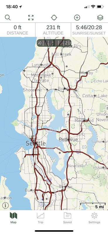
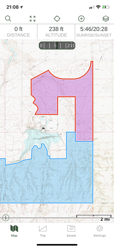
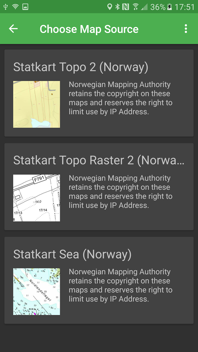
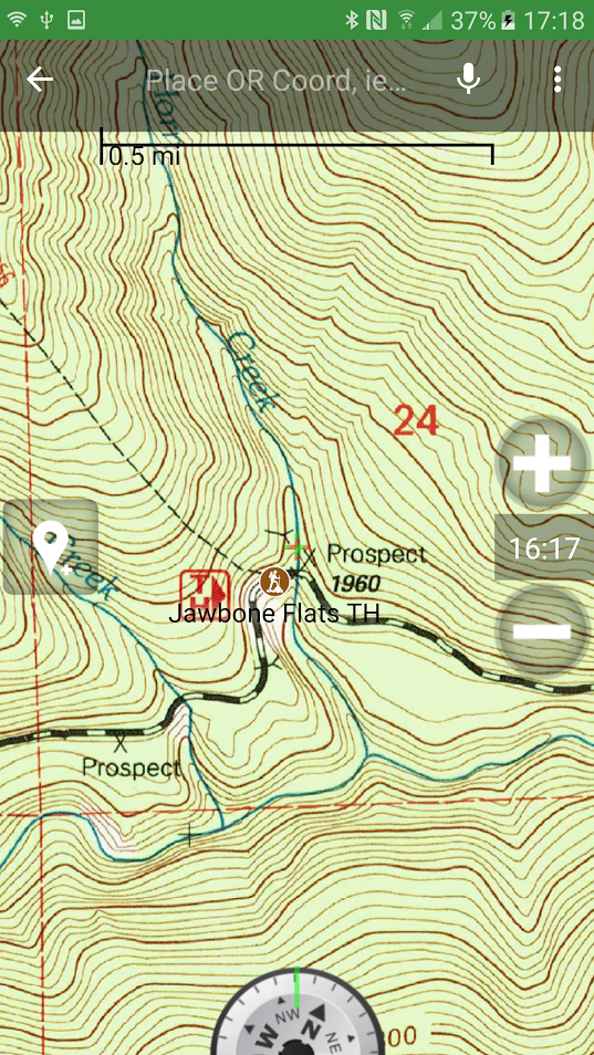
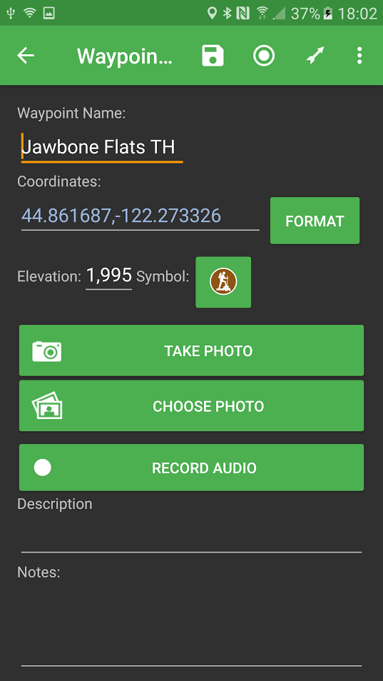
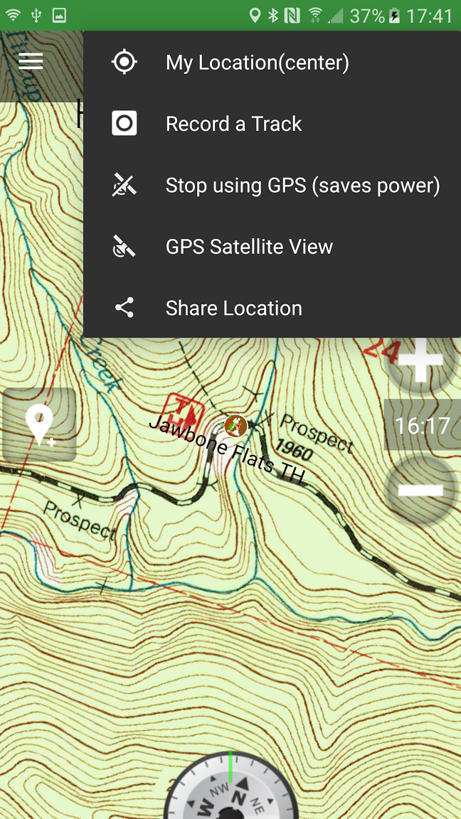
Accuracy Comparison: Waypoints collected at the same point from various devices on different dates at different times For general field work, a smartphone/tablet is sufficient in almost every use case. The main drawback is that some devices will filter out small location errors you would normally see on an unfiltered unit. This can make it difficult to precisely locate a predetermined point (like a geocache). When you are moving slowly around trying to locate a point, the OS will interpret this as a location error and will not register the movement. This seems to be less of an issue now that we have aerial photos which give us context. 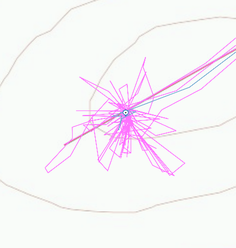 A GPS track from a stationary GPS showing location errors over time Despite this filtering, your phone will meet or exceed most consumer GNSS units as modern smartphones now support GPS, GLONASS, and Galileo. Another drawback is the risk/cost of damaging your personal device in inclement weather on rugged terrain. GaiaGPS I’ve tried several GNSS apps over the years and settled on GaiaGPS as my application of choice. It performs the same functions you would expect from any consumer grade GNSS unit with the added features available from a smartphone (a big bright touchscreen, a camera, and easier keyboard use). GaiaGPS is an (paid) iOS and Android GNSS application. It costs $20 or $40 per year depending on your license but is free to emergency responders. There are differences between iOS and Android versions but I do not have access to Android devices for testing. Data Collection Types: Waypoints Tracks Areas (polygons) Routes (straight line or routed) You can attach photos and notes to each of these. The notes will be exported in your KML/GPX and can be added to your attribute table as a single field. If you are good with scripting, you could manipulate your KML/GPX into something resembling attributes before importing it. GaiaGPS vs. ArcGIS Collector ArcGIS Collector is frequently used for biological data collection. It’s well thought out and implemented for GIS-centric data collection (for the most part). I almost always need something Collector doesn’t offer and here is where GaiaGPS fits in. The chart below highlights some of the more important and useful differences between GaiaGPS and Collector. 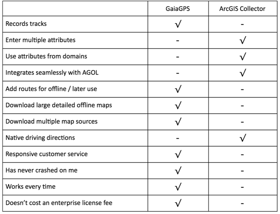 Relevant differences between GaiaGPS and ArcGis Collector Various Screen Shots
GaiaGPS and Custom Web Maps
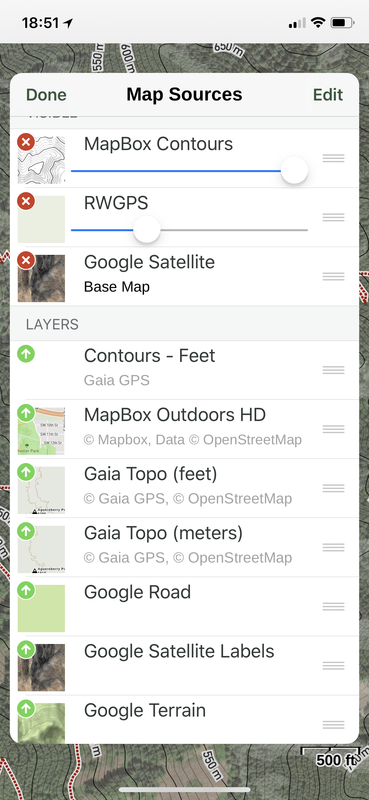
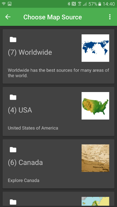
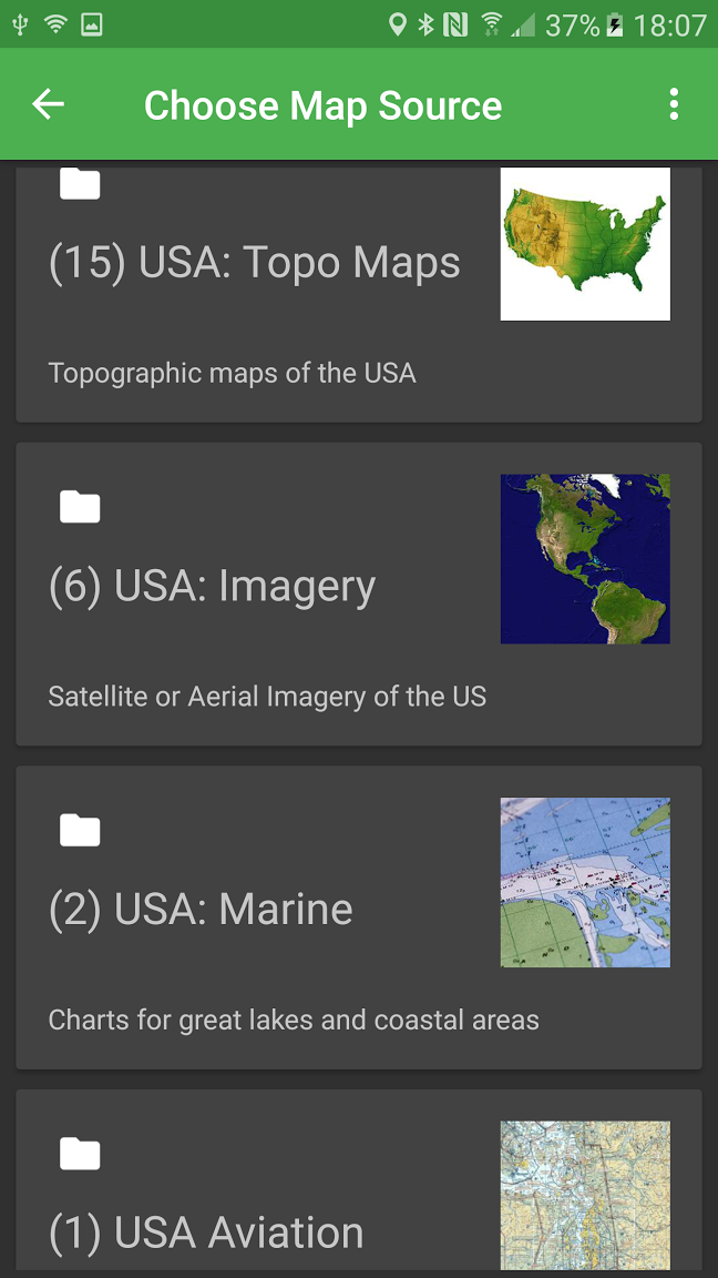
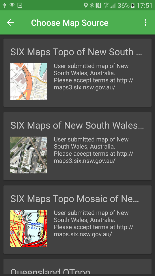
GaiaGPS offers dozens of map sources for download, hundreds if you count the US Hunting Overlays. Most of these are high quality, some are authoritative, others are open source and/or are so complex they need to be verified before use (Public Land). You can import and download any maps served by a web Tile Map Server (TMS). If you are looking at a global web map and you want it to import it into GaiaGPS, there’s a good chance you can. To add maps to your phone, GaiaGPS offers an online tool or you can create a TileJSON file here. The TileJSON file can be dropped it into the File Sharing pane in iTunes (iOS version). When adding custom maps, you are looking for map tiles served in this format: Example URL from OpenStreetMap: http://c.tile.openstreetmap.org/5/15/14.png How you change for use in GaiaGPS: http://c.tile.openstreetmap.org/{z}/{x}/{y}.png If you happen across a map you want to add, sometimes you need to do a little detective work. You can right click on the map and open a map tile in a new window or view the page source/elements/network activity to see the map tile URLs. If they are formatted like above, you can add them to GaiaGPS. I’ve discovered several cool maps that I can add to GaiaGPS this way. If you’re a Mapbox user (and you should be), you may have noticed the URL scheme above matches the Carto Share URL minus your Mapbox access token. Any data layer you add to Mapbox can be added to GaiaGPS using the Carto URL. You can add MBTiles, KML, GPX, GeoJSON, Shapefile (zipped), CSV or GeoTIFF to Mapbox and then add them to GaiaGPS. You can finally take that cool choropleth map on your hike! Mapbox compatibility gives you a lot of flexibility with your data. You can have a custom map layer with only GeoTIFFs, a layer with only contours, a hillshade-only layer, or a layer with vector points from a shapefile you downloaded from a geospatial library somewhere. The smartphone is a great solution for many applications. In addition to it being an integrated GNSS solution, it contains a still camera, video camera, and an audio player and recorder. I’ve had occasion to use each of these functions both before and after the smartphone revolution and it is much easier to carry a single device in your pocket than each device in your pack. Resources https://gaiagps.com https://doc.arcgis.com/en/collector/
1 Comment
Written by Kyler Speich
If you have never heard of “Phodar” I don’t blame you. I came across the word while doing research for doing an outline for a Rescue Drone, but that is a whole other story. Phodar is a hot topic in the Geospatial nerd community right now because it gets you the same last return readings as Lidar, but does not use actual Lidar. For me it was MIND BLOWING to watch as someone at the University of California proceeded to create this interactive phodar map-> http://igis.ucanr.edu/Drone_Phodar/. It uses 3D mapping, and interactive tool bars so that you can see the outlines of all the trees, hills and even the grass if you zoom in and set your “Point Budget” high enough in the menu. The biggest reason Phodar has become big news is because you do not need anything more than some software, a drone and a camera. It uses the pixel data with photogrammetry to determine elevation and maps it accordingly in a 3D format. Lidar still has a big edge up depending on what kind of information you’re trying to derive. Phodar still only gives you available data that the camera captures, but Lidar can still penetrate non-earth matter and give you many returns. But I find the uses for agriculture or small scale mapping that requires Z axis measurements, this would be significantly cheaper than having someone fly Lidar over your area and process all of the information. I could even see Phodar being used for recreation by Alpinist or rock climbers to scout out routes in real time. Written by TJ Hutchisson The CARTO website offers The Map Academy, a set of free tutorials/exercises ranging from easy to hard to mixed, focusing on topics such as map design, working with data tables to create interactive maps, or how to use CARTO’s JavaScript library. The proclaimed goal of The Map Academy is for users to “learn to create maps on the web and visualize geospatial data.” This summary focuses on a section titled Intermediate Map Design, and more specifically How To Choose Map Colors, Part 1. How to Choose Map Colors is split into two parts: Part 1 discussing color perception, and Part 2 on choosing proper schemes. The topics covered in this first lesson are a mixture of general color theory, and how to specify color in CARTO. The lesson very briefly introduces the color spectrum and the concept of color relationships, providing examples of complementary and analogous colors. 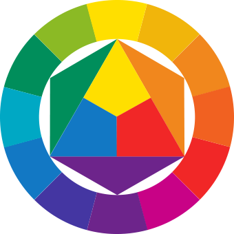 The lesson then addresses how to adjust for legibility using hue, saturation, and value. These terms are BRIEFLY defined, and no hard and fast rules are given about how exactly to change these qualities in the most effective manner. This section seems intentionally vague, asking the viewer to use their judgment, and ultimately provides outside resources for when your colors are not working well together. However, an effective example is used to demonstrate how altering saturation and brightness can dramatically change the perception.  The high contrast makes these colors nearly vibrate.  These toned down colors are much easier on the eyes. The lesson then becomes geared specifically to CARTO, and the numerous ways in which you can define color in CartoCSS.
The lesson ends with other considerations when selecting and adjusting colors. First and foremost, considering the accessibility of maps, particularly for people with color blindness and limited vision. Again, outside resources are offered for checking this aspect of legibility. Other considerations mentioned:

Overall, this lesson is only a cursory look at color and color perception. While none of the topics or terms are defined in depth, this section of the Map Academy does serve as a good starting point, and ultimately is more useful as a tool for providing a list of resources. Written by Michael Shostak CalTopo is an online web application to create topographic maps for anywhere in the United States or parts of Canada. This app has been primarily focused on hiking maps but has added more advanced analysis in recent years. As an avid backpacker that likes to visit less frequented places, Caltopo is great for creating maps that are not produced commercially or even to save money on maps that are available for sale. There is never a reason to leave home without a map for your hike now. The user interface when first arriving at the site will feel very familiar to those with GIS experience but also is quite friendly to those without. CalTopo uses layers to display data and has a number of preset layers that cover the entire country. The initial MapBuilder Topo layer is the most useful for creating maps that use trail and road infrastructure. To start your line simply select the +Add New Object from the table of contents and select from the available functions, markers (or points) and lines will be the most commonly used but a number of other options are available. My favorite part of this app is the snapping feature. When creating a line on a current trail or road simply hover over the starting point and the trail will become highlighted, once you click the line will then snap to the existing roads and trails as you follow along. 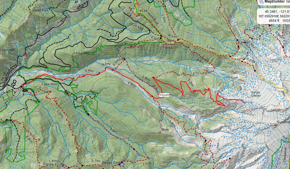 Importing and exporting is another useful tool that adds value to this platform. Imports are limited to GPX, KMZ, and KML allowing you to bring in lines and points that have already been created and show them on the map. Exporting adds in the ability to connect with a Garmin via GPSIO or to save as a georeferenced PDF using the print option. These PDFs can be printed or brought into any number of other applications for use on your phone while in the field. In addition, a GPX file can also be made for lines and points that you create in CalTopo. 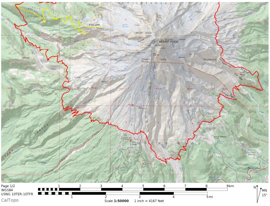 While creating lines can be a little glitch, overall this app offers incredible value to users at the free and premium levels. The extensive base layers offer data like land management, fire history, sun exposure, slope, and SnoTel site information brining the scope beyond just hiking and into some analysis. From a cartographic sense, the finished maps do not offer much from a design perspective and suffer from some labeling issues and lack of other cartographic choices but from the functional side these maps are great for their purpose. Having paper maps could save your life someday and this app makes it easy to create them for anywhere in the US, free of charge. 
Written by Val Rudolph
I went to the GIS in Action conference at Portland State University on April 23rd and 24th. I have come away with the idea that conferences are something you do that can be fun, depending on your attitude that day. And it’s definitely good for you, like eating your vegetables, especially if you’re a student. I’m posting my recollections of the talks I attended. If you understood something differently, please take a moment to tell me. Attending the conference stretched my wings. I’ve been meaning to apply to Portland State for years, and it finally got me in the door, for an actual academic reason instead of just going there to watch a movie or attend a meeting. I still wish there were a public university, or branch of PSU, on The East Side. That has got to be coming sooner or later! All the presentations were well “over my head”. But, as an instructor told me recently, every time you attend a lecture, you learn something, even if it’s just getting your brain accustomed to the basic concepts and terminology. Also, the conference is a way to learn what professionals are actually doing out there, how they went through their development process, and whether or not you find the topic interesting. I was surprised how interested I was in EYEON18 golf course drones service. They save golf courses money by flying over them a the client’s desired interval during their local growing season, then sending them true color and NDVI images. So you can see where problems are and catch them quickly. The speaker used the example of a golf course employee using a key to turn off a particular sprinkler head for temporary convenience. If he forgets to turn it back on, the dry spot will soon start to show up in the imaging, and a groundskeeper can go out and correct the error. Each sprinkler head has its own coded number, if not on the ground, then at least in the data. On one golf course, the imaging showed low-vitality circular areas around each sprinkler head. The problem was that when the sprinklers were installed, they were set in place with sand instead of soil. So the course was able to correct the problem. David Howes presented at one of the Web Applications talks. Here’s what I understood: Mr. Howes holds a PhD in Geomorphology. Geomorphology is the study of landforms and geological processes. GIS imagery plays in important part in this discipline. Mr. Howes, however, told us, “I’m not a mapmaker. I’m a developer”. I think that he is currently engaged as a GIS widget-maker. I’ve been struggling a bit to firmly grasp the concept of the “widget”. It’s not the same thing as an application. It’s something you use in an application. As he put it, “The functionality becomes available to the user” when you add it into your Web Application. Another thought that shed some light for me was, “A widget is basically a folder full of files”. I guess I knew that, but I’m so comforted to hear it from a professional! Here were my main take-aways from the Widget-making presentation: WebBuilder: He says to go through ArcGis Online. But to make widgets, you need the Developer Edition. To this, download the SDK zip file, unzip to your local drive. Then the server starts. You work in 3 folders concurrently:
You have to keep your files synchronized as you work. There is a tool you can use that automates this process, but it sounded to me like he does not use it personally. General tips: “Start very small”-i.e.: two buttons on a form. “Develop really clean code so you understand yourself”. In my words, if longer expressions do the same thing as shorter expression, use the shorter ones, and be completely consistent. “Reuse things as much as you can” “Make the most of the GeoWeb App community”. In my words, as long as your peers don’t mind you using what they developed, and it works for you, use it as much as you can. ESRI has a Research and Development center in Beijing?! Visual Studio code is “absolutely fantastic, especially for JavaScript development”. (I think that means JavaScript is something you use to make the widgets). JavaScript is something you use in tandem with HTML for more detailed work? Be very, very careful when you remove files between the three types of files. This fellow has lost work and knows about this from hard experience. Ouch! Mind-blower: in HTML, you control color display with numbered codes! Notepad++ is a coding editor. Oh, that’s why we use it in labs! F12 you can hit in browser to debug the feature server. (What is a feature server?) …a “a Map Server is a host that provides map services, and a Feature Server is a host that provides feature services.”-https://gis.stackexchange.com/questions/126373/difference-between-feature-server-and-map-server?utm_medium=organic&utm_source=google_rich_qa&utm_campaign=google_rich_qa This is some deep technical stuff, this GIS technology. It takes a lot of work to perform magic! Written by Thomas Pham Indie Mapper (http://indiemapper.io/app/) is a free web-based thematic mapping tool developed by the guys at Axis Maps – Andy Woodruff (Bostonography) and Zach Johnson. It was developed some 8 years ago and from what I have seen, some things have not been maintained such as pop up help link images. However, the functionality is still there and it is still interesting to play around with it. So what can it do? Everything is web based so all you need is a web browser. Built into the application is some preset data layers you can choose from including: boundaries, countries, states, populated places (which all come from Natural Earth). There is also some additional thematic layers that can be added ranging from agriculture to water consumption. You can also add in your own data, which is limited to: KML, shapefiles, and GPX. You can save your project to a .imp file which can be reused simply by re-uploading that file to the site. Lastly, you can add in a north arrow and create annotations. 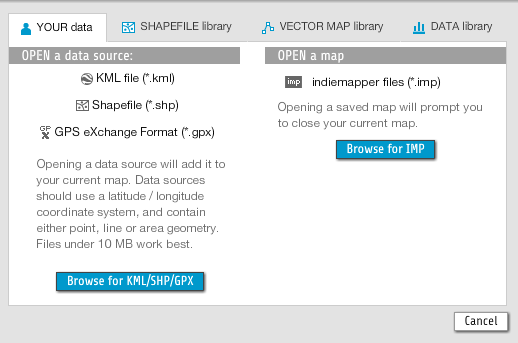 It allows you to project your data automatically although it is limited to 14 different projects. One nice feature is that you can filter projects by distortion type. For example, you can show only projections that preserve size, shape, direction, or is a compromise. Additionally, it also gives a brief overview of that specific projection and the distortion that is associated. 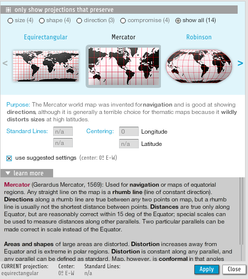 Once you complete your map you can export it. You have the option to export as an SVG, JPEG, or PNG and specify the size. 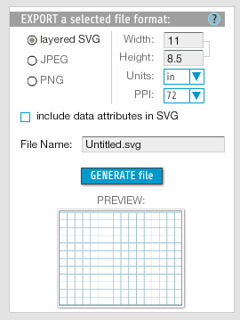 Here is an example of a bivariate choropleth map I created that visualizes patterns in percent obesity and percent diabetes. For the bivariate choropleth style, you can select number of classes, classification method, choose from pre-defined color schemes. 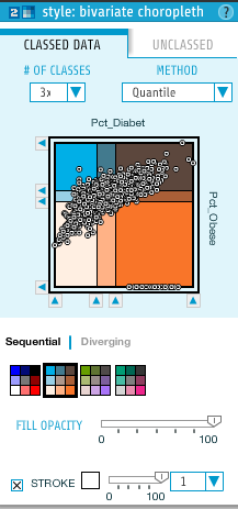 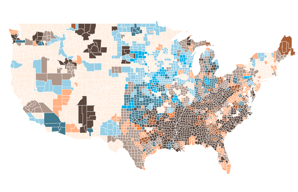 Overall, you can tell that the website is a little bit dated but there are certainly some interesting features. I really like that you can create bivariate choropleths and cartograms easily. It does become sluggish when you bring in large datasets.
Written by Lindsay Cumella We as GIS professionals know that it is the information which we attach to our spatial features that deserves the focus. And while some data are objective, many are subjective, dynamic, and personal. How the latter category of data is generated and by whom can be incredibly important, as a recent issue with a project called Queering the Map highlighted. Queering the Map began in Spring 2017 by design student Lucas LaRochelle in Montreal, Quebec after they biked past a spot that held a memory about a past relationship. Rather than publish this information in any other forum available on the internet, LaRochelle chose a map. They chose to present the information in spatial terms, leading to a publicly modifiable Google based interactive map, which quickly became home to a collection of location based queer stories from around the world. Upon hearing of the project, I assumed the map would contain features like gay bars, community resource centers, queer owned businesses, etc. But the entries are much more personal and diverse, from people marking the places they came out to now extinct gay spaces to the locations of intimate relationship moments. The experiences also represent a greater breadth of the queer community, with a greater percentage of stories than are usually seen in mainstream coverage of the LGBT community coming from people of color, people in rural areas, and people pushing against gender boundaries. This result represents the ideal of what can be achieved by an interactive map; crowdsourcing spatial information can build new pictures that change our understanding of what happens where. 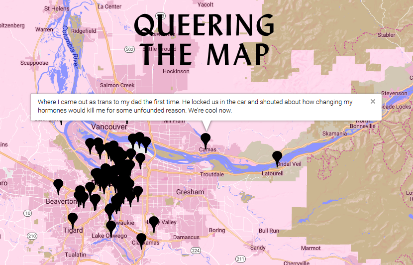 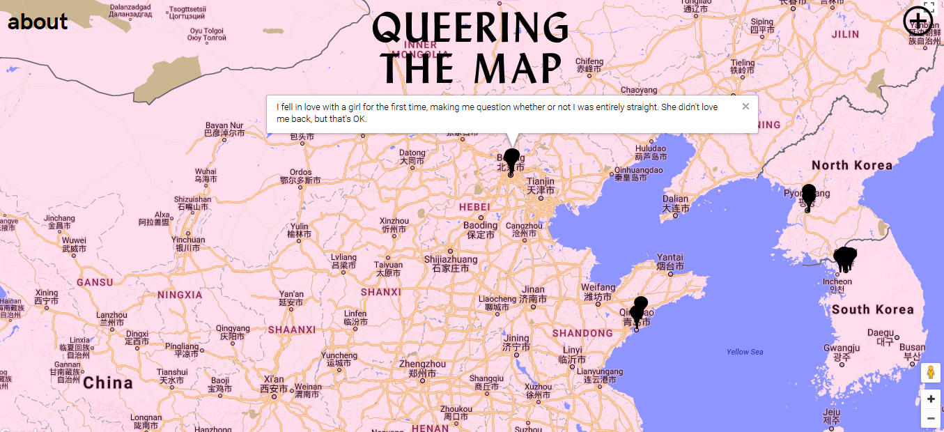 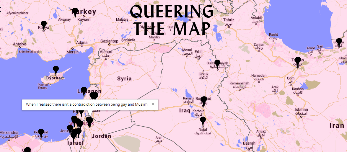 When the map was spammed with thousands of pro-Trump messages in February 2018, the site had to be taken down. LaRochelle, a designer rather than someone in the GIS field, drew upon the expertise of volunteer coders and web security professionals to re-secure the website. It went back up just earlier this month, April 2018, with added security features, some of which are necessary to safely maintain the original idea of the map story project and some of which necessarily push back against the completely open nature of public contribution. The site, for example, no longer collects any of its users’ geodata, which means practically the site always opens centered on Montreal, but also protects users in countries and regions of the world in which it is still dangerous or even illegal to be gay. A panel of moderators also monitor the entries for obvious trolling and language of many -phobic varieties. These individuals have the common on the internet, but near impossible, job of defining boundaries that are not universal and most likely in flux, e.g. what counts as hate speech or who is included under the ‘queer’ umbrella. Currently, the Queering the Map Project aims to keep the latter definition completely open regarding who can add spatial information to the map. “Whatever constitutes queerness or queer action, or queer space, or queer geography counts for this project,” LaRochelle said. As GIS professionals, I think this situation highlights the challenge we face specifically while creating and maintaining interactive maps which are based on collaborative data entry. We must choose how to solicit, collect, classify, limit and censor the information around which our maps are centered. Choice of features, both interface and security related, must be evaluated to protect primary voices around the subject matter when the map is not meant to reflective purely objective data. The queer community is only one example of a realm undergoing active and dynamic change, and how we map information relating to those realms needs to include a balance between broad representation and security, one which respects that changing nature. 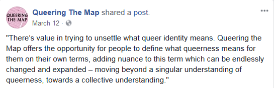 Written by Nicole Elsmore Stumbling upon the National Geographic’s MapMaker Interactive seemed like a fortunate thing, and inside I squealed with glee. The splash screen promised country facts, coordinate data, and customizable map features. 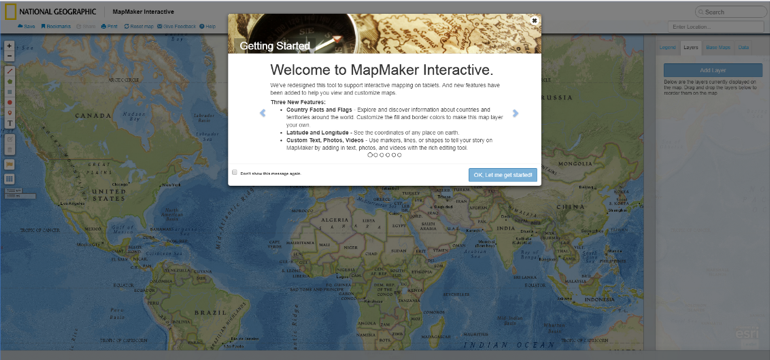 Unfortunately, my experience only went downhill from here. Behind the splash screen stood the ominous, hideous transverse Mercator world projection. The program allowed me to zoom out and scroll through the infinite world and also allowed me to zoom in to the point of the map breaking into gray tiles reading “Map Data Not Yet Available”. Although the Nat Geo data layers displayed consistently throughout the infinite world, any data I added stuck to only one iteration.  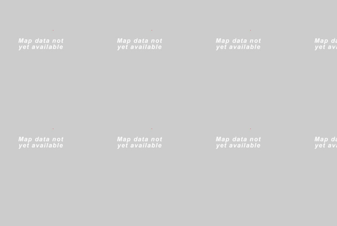 The datasets provided by Nat Geo were viscerally the most interesting aspect of the MapMaker. They provided a few dozen datasets, with everything from “Sweet Potato Production” to “Big Cat Territories”. While these datasets were inherently interesting there wasn’t much I could do with them. Altering the transparency of the layers was the only “analysis” tool available. A promising tab labeled “data” on the right-side menu remained blank in spite of my desperate poking and prodding and this tab’s lack of functionality proved the biggest disappointment of MapMaker. The “legend” works as expected, providing the range of data values represented in the layers. The familiar capabilities to add your own points, polygons, and text to the map, to create bookmarks, and to save and export your map, are comforting but lackluster. One positive is the ease with which map layers are re-ordered. Once you enable the country flag and fact ability, clicking a country enables a pop-up that provides a brief country description and provides a list of facts, a charming but un-inspiring feature. Many of the text pop-ups providing information on data layers and countries ran in one big, long sentence that spilled off the screen making them difficult to read.
Essentially, National Geographic Interactive MapMaker is a data visualization tool that allows for comparison of datasets using the transparency function. Besides having some unique datasets and the National Geographic brand name, MapMaker is a poor representation of the capacity of interactive maps. Written by Steve Lantz Social explorer is a web based mapping platform that aggregates U.S census data as well as from other academic and private institutions. Social Explorer has won many awards for its webs maps. Awards include WMA standard of excellence and the Gold Award from the Modern Library Awards. The clients of Social Explorer include but not limited to the New York Times, Stanford University, Yale University and Target. 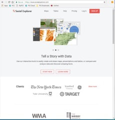 You can start using the data by clicking on “Start now” tab. The web maps that Social Explorer creates are extremely intuitive and easy to use. By default, it starts out at a national scale looking at population density from the most current census. To change the data that is being displayed click on the “Change Data” tab to open a drop down menu. Within the menu there are many different types of data that can be mapped. Some of the different types of data that can be mapped include education, house value, health as well as many other categorizes. Again some is limited in the free version. 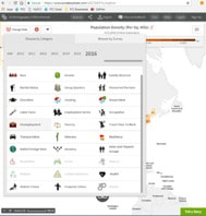 Additionally, the user can easily switch back and forth between the two maps the user is looking at. There are two different options for comparing two data sets. There is the “swipe” version. In that mode you can move the cursor and slide it from side to side to gain a better idea of the difference and similarities between the two maps. 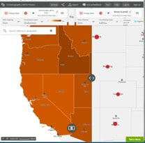 Written by Erin Woolbright BackCountry Navigator is an app for any android device, whether that be a tablet or smartphone. BackCountry Navigator is ultimately not a free app, however you can download the “free” version, but it only lasts 21 days before each map tile is delightfully plastered with the word “DEMO.” To purchase, it’s only $11.99, which is significantly cheaper than another handheld GPS unit. I’ve used both the Garmin eTrex 35t and Oregon 650t and can say that this app is pretty comparable and well worth the price of an expensive 6-pack of craft beer. I was first introduced to this app when my Oregon 650t decided it didn’t want to live on dry land anymore and jumped (re: I dropped it) into a very, very deep lake. Unfortunately, my wanting to save some money after handing over $300 coupled with poor foresight, I didn’t purchase the insurance (ALWAYS purchase the insurance) on it. I downloaded the app on my phone soon after and have been using it ever since. This app is not just for the US, but there’re maps of some kind (with various restrictions) for pretty much everywhere worldwide. Some countries/regions have more maps available than others with differing degrees of precision/extent.
One of the neat things you can do with this app is download maps for offline use as if you’re hiking, there’s a high chance that you won’t have any cell service. As long as you keep your phone/tablet’s GPS on, BackCountry Navigator can still track you on your pre-downloaded maps. When I was living out near Mission Ridge in Wenatchee, WA, I had absolutely no cell service unless I stood in a 4”x4” area near the front of my VW bus. When I was someplace that had service, I would download as many maps as I could of the area so if I decided to go wander, which was often, I wouldn’t get lost. If you’re using this app offline due to no cell/WiFi service, then I highly recommend putting your device in airplane mode and shutting off any unnecessary processes as this eats up battery power. I personally always bring a few USB power banks with me for this reason. Another feature this app has is the ability to track and record the trip. For example, once you get to a trailhead of your choosing, select “Record a Track” and the app will start recording your progress on/off the trail. You can also add waypoints wherever you want by just clicking on the “add waypoint” symbol to the left-center of the screen. You can add a photo or record audio unique to that waypoint if you so choose.
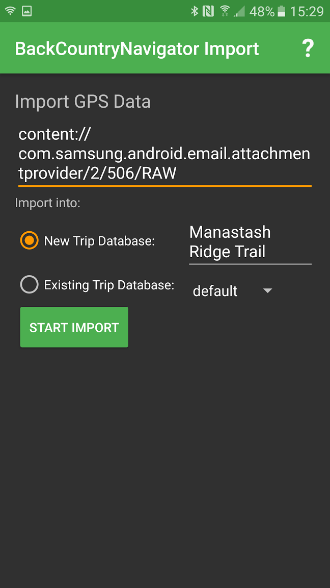
You can also import .gpx, .kmz, or .kml files into the app. It’s a little wonky for sure, but it works. Typically, when I’ve imported trails there are a lot of unnecessary waypoints that I would go through and delete. You can also export your route. To do this you need to connect to a computer or laptop and just search into your device for a folder called bcnav and there you’ll find a .gpx file with whatever name you gave it. You can import those into Google Earth or ArcMap has a conversion tool.
Overall, this is an awesome app to use if you’re outdoors-y. It’s not just for hiking, you can use it for just tracking walks around a neighborhood or cycling. I have a friend who used it when she was looking for relatively easy walks she could take her grandparents on. However, there are a few drawbacks. Some of the maps you do need a subscription to use, such as Accuterra or most of the CalTopo maps. The subscription is for access to those hosting companies, not BackCountry Navigator. Accuterra is something like $20/mo and to my knowledge, both of the subscription-only map providers only cover the US. Don’t get me wrong, they are great quality maps but I’ve done just fine with the non-subscription ones.
Another app called Gaia GPS is also highly rated, however this is a subscription service that costs $20/mo. From what I’ve read, the process of jumping from computer to phone/tablets is a little less jerky, but it’s fairly similar to BackCountry Navigator. My main takeaway from this is that if you want a solid GPS for areas without cell service/WiF and aren’t ready to throw down at least $200 for a separate handheld GPS unit, BackCountry Navigator is the way to go. |
AuthorBlog posts are written by students in the Interactive Map Design course at Portland Community College. Archives
June 2018
Categories |


 RSS Feed