|
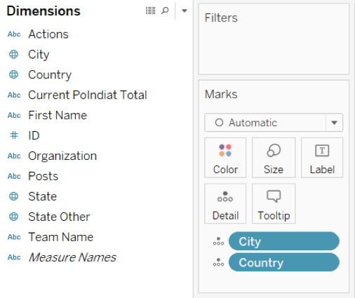
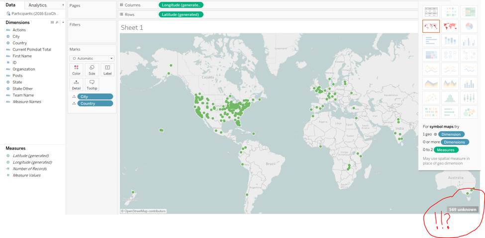
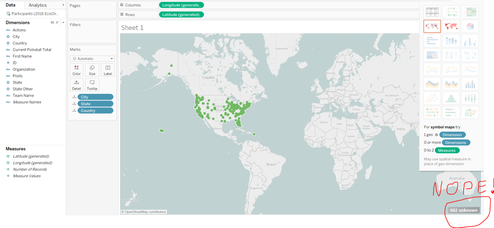
Written by Baxter Shandobil For my final project, I am working with The Northwest Earth Institute, an environmental non-profit here in Portland. Each year they host an “Ecochallenge” that encourages people to choose one simple action to reduce their impact on the environment, and stick with it for the duration of the challenge. The 2016 edition had over 8500 participants from around the world. I was tasked with creating a map to demonstrate the breadth of the worldwide participation, and was given a CSV with the name and location of each participant. Unfortunately, these locations were not geocoded. For that reason, in addition to the fact that they wanted an easily reproducible map, I decided to use Tableau to make my web map. Tableau has a feature that will automatically geocode address for you. The software indicates that it has recognized city, state, and country fields as locations by putting a little globe icon next them as seen below. Just drag and drop into the box that says “Marks.” Simple right? Or so I thought… But here is what happened when I dragged City and Country into my worksheet: 569 Unknown Locations??? Okay, so let’s try adding the states in to see if that helps: In addition to their more unrecognized locations, adding the “States” field confused Tableau further and all the International points disappeared from the map.
I attempted to resolve this a few ways:
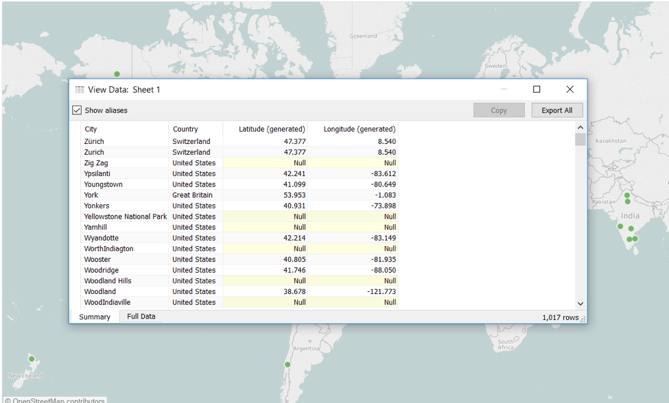
After all that, I realized that it actually is possible to export the coordinates back out to a CSV, I just did not dig deep enough on how to do it. I had spent so much time diagnosing the issue that I just wanted to power through and get it done. For future reference here is how to do it:
1 Comment
Written by Haley Jones
“Geotagging” is something that happens automatically to many of the photos we take, and we may not even realize it. If a photo has been geotagged it simply means that there is location information stored in the picture’s metadata – the picture knows where it was taken! Photos taken with a smart phone or tablet, or a GPS-enabled camera will inherently have this information. So then, what is the best way to store and use these geotagged photos? And how can we add geotags to photos that weren’t taken with a smart device? Luckily for us, a really useful photo-sharing platform already exists that will host and organize loads of pictures for free. It’s called Flickr! Aside from storing, organizing and sharing our photos, Flickr is a very useful tool for geotagging photos that do not already have location information embedded in them. In fact, according to my research, Flickr actually invented the term geotagging, so they must know what they’re doing! How to geotag photos in Flickr It’s really easy. FYI, Flickr allows us to browse pictures in a map view. We can see where our own pictures were taken, or if we want to see pictures of a particular location, we can go to that spot on the map and see all public-shared pictures of that location. When uploading pictures that already contain location information, Flickr will automatically allow us to look at them in a map view. However, if we’d like to geotag a photo that doesn’t already have a location then there is an option to “add the photo to your map.” This opens up a map where you can manually make a pin drop of where the picture was taken, or search for the location. Flickr will then display a point on the map that shows where that particular photo was taken, and just like that it has been geotagged! Now, how can we utilize Flickr’s geotagged photos for use in our interactive maps? We have many options, here are a couple: Did somebody say mashup? There is a Flickr API. This is a great option for developers. The Flickr API seems very useful for incorporating location based photos into an interactive map. I’d love to elaborate further on this, but it’s a bit beyond my scope right now. However, here’s something interesting! We can incorporate geotagged photos in Flickr into AGOL’s Story Maps. Here is how to do so using the Story Map template called “Story Map Tour”: Add Geotagged Photos to Your Web Map We can also place geotagged photos directly from Flickr onto our AGOL map viewer by adding a link to a KML file (the same way we would add a data layer from the web by pasting in a URL). Then, photos from our Flickr stream automatically populate on the map. They show up in a thumbnail view, hovering over their appropriate locations. Here’s a video: How to Add Flickr Photos to AGOL Map Viewer Written by Adele Rife
Maptivism: Using Online Maps for Activism One aspect of GIS that got me excited to learn more was the potential power maps have for activism and social justice. In other words, the use of maps to promote a cause, or maptivisim! Maps, especially interactive maps, can display a lot of information visually and have the potential to reframe certain topics when presented spatially. The impact can be strong, particularly when people are intimately familiar with a certain geographic space and/or topic. Furthermore, maps can display complex data in an easily digestible format, which makes data and data analysis more accessible to the population at large. However, maptivism isn’t limited to online maps and it is important to keep in mind that while web maps do add in a lot more capabilities and engagement, not everyone has access to the internet. One example of maptivism is www.understandhomelessness.com, a website that defines homelessness, displays complex data on an interactive web map, and presents potential solutions for policymakers. Understanding Homelessness is a project that aims to “help overcome negative stigmas about people experiencing homelessness through education, bringing transparency to the geolocated data that exists about the homelessness issue in the United States, and providing inspiration and solutions for city officials, organizations, and citizens to approach this challenge with hope.” The website does an excellent job of defining homelessness, displaying complex issues with infographics, and visualizing homelessness data in an amazing interactive web map. I highly encourage you to explore the map! You can change the data topics that are being displayed, the layout it’s displayed in (some of which I’ve never seen before), and more. The interactive map is powered by a combination of Leaflet, OpenStreetMap, Mapbox, Creative Commons, and Continuity. There are a lot of other examples, some of which were talked about at last week’s Resistance GIS mini-conference at PSU. Some projects that I’m excited to be working on include:
What are some maptivism projects that you’re working on or want to work on? Do you have any favorite maptivism examples? Written by Heather Hall Gone are the days of paper-based surveys. Having to lug around a clip board, catch papers as they fly off into the wind, have people tell you to get lost cause they don’t trust people with clip boards. ESRI’s Survey 123 is a fast way to collect data using an app on your phone or tablet. Surveys can be downloaded on multiple devices, data can be collected offline and after the data is sent it is automatically uploaded to your AGOL account. You do have to have an ArcGIS subscription but you can get a free 60 trial when you sign up to use Survey 123 and your data can be downloaded as a CSV, shapefile or file geodatabase. To get started go to https://survey123.arcgis.com/ and create an account (you must have an AGOL account first to use Survery 123). Click on create new survey. I like to use “Get started using web designer” for basic surveys. Fill out the name of the survey and tags and start adding questions. Download the Survey 123 app to your phone or tablet and choose download surveys and start collecting your data. You can choose to send the data right after you collect it or wait in case you need more information. Once all the data is sent you can log into AGOL and you will have a new folder in your content with all of your survey data. There are two feature classes created, one that just says the name of the survey and one that says “fieldworker” after the name of the survey. Both are editable and you can add points, pictures or change the data any way you like. Surveys can be shared with multiple people and they can add their own data to it. I only explored the very basics of Survey 123 but found it to be really easy to navigate and collect data.
Here are a couple of interesting case studies involving Survey 123. Written by Kaitlin Sagdal I spent some time reading about the update and exploring it myself. I will give you my top 5 exciting updates you will want to see for yourself.
Written by Matt Przyborski
For many of us just developing our GIS skills, mastering the art of map making can seem daunting. Even the acronym “GIS” can be a bit intimidating. “Geographic” references an entire scientific discipline, “Information” sounds both vague and all-encompassing, and “Systems” implies that we are dealing with a myriad of inputs and components, all of which we will have to understand to some degree to do our job. As someone who knows only the bare basics of computers and is not a web designer, map making can be challenging for me at times. Instead of focusing on what I know I can do, I often find myself getting overwhelmed at all the options available and all the steps involved in going from a blank screen to a map I’m proud to show off. A recent presentation by map and web developer Nik Wise helped me to look at map making with a new perspective. There were three main points I took away from Nik’s discussion that I think will benefit me immensely going forward
“The maps we make are really just big spreadsheets” When I think about it, this statement is obvious. After all, when we make maps we are simply showcasing data in a spatial format. However, hearing an accomplished map maker like Nik say this offhandedly, making it seem like it’s the simplest concept in the world, was very helpful to me. I deal with excel sheets a lot at my current job. When I remember that what I’m dealing with is simply a spreadsheet of data with an additional column for location, my entry point into making the map I want becomes a bit clearer and the whole process much less intimidating Keep it simple and follow your intuition Although the task of creating my map is now less daunting, I still need to find the best way to display the data that I’m dealing with. This is another step where I can find myself overwhelmed by the options available or overthinking how the data should be displayed. Nik had some great examples of his favorite maps, all of which were among the most simple and straightforward ones I’ve seen. One was a map of Portland, with a simple color scheme and delineation separating the city into “types” of neighborhoods as he viewed them. Another map was simply points with labels and nothing else. These were good reminders for me that trying to force data to look how I assume it should look on a map is not always the best approach. Simple maps with intuitive layouts can be much more effective at telling the story you want to tell. Map making as a language Lastly, when asked if GIS is something everyone should be doing or not, Nik made a great analogy to reading and writing. Not everyone in the world has a PhD in writing or language but most can read and write and we’re much better off for the latter. Thinking of map making as a language that not everyone is an expert at but that most can use to communicate basic ideas is very helpful to me. For one thing, it gives me the confidence that whatever level of map making skills I have, I can still communicate what I want to others. Also, it’s a good reminder that what I’m communicating doesn’t have to be overly complicated. As I continue to accumulate more GIS skills and knowledge, I think returning to the basic ideas above will serve me well in my map making abilities.
Written by Parker Hill
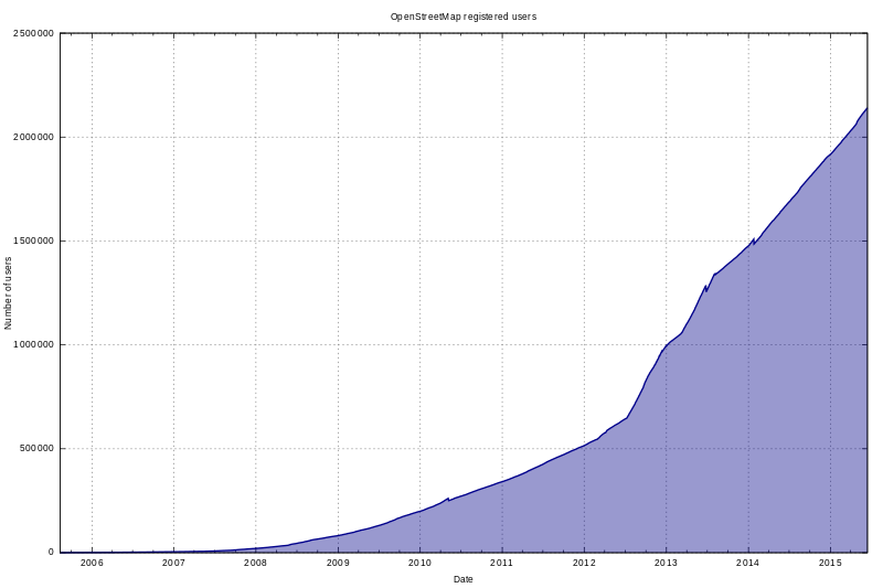
When I first learned that OpenStreetMap (OSM) existed, I immediately thought of Wikipedia. An online interactive map that anyone can edit or add data to? What an incredible concept! I read several years ago that Wikipedia has become by far the largest encyclopedia that has ever existed—the English version alone contains roughly sixty times as many words as the second largest English-language encyclopedia—and due to its dynamic, “alive”, nature with over thirty million registered contributors, it has become very, very accurate, though still not accepted as a reliable resource to cite in an academic context (it will be interesting to see how this changes over time). What is intriguing about Wikipedia is that the more it grows and the more people that contribute to, edit, and maintain it, the more apparent it is that our species as a whole wants it to work correctly—meaning that we, as users, want its contents to be unbiased, factual, accurate, and up-to-date (of course we do). Vandalism of Wikipedia is easily detected when it occurs, both by human contributors and vandalbots, and inaccurate information recorded innocently will be corrected as the article evolves over time. The sheer vastness of Wikipedia ensures that each contributor’s input is infinitesimal relative to the total volume of content—it’s nearly impossible to damage it. Wikipedia may be the greatest encyclopedia humans have yet created. Anyway, back to OpenStreetMap. Before I ever even typed in the URL for OSM, I knew that the more people actively contributing to it, whether by creating, correcting, or editing features, the more useful, accurate, and up-to-date it should become. I’m glad to report that there are presently over three million registered users with OSM accounts and this number is growing.
The Evolution of OpenStreetMap
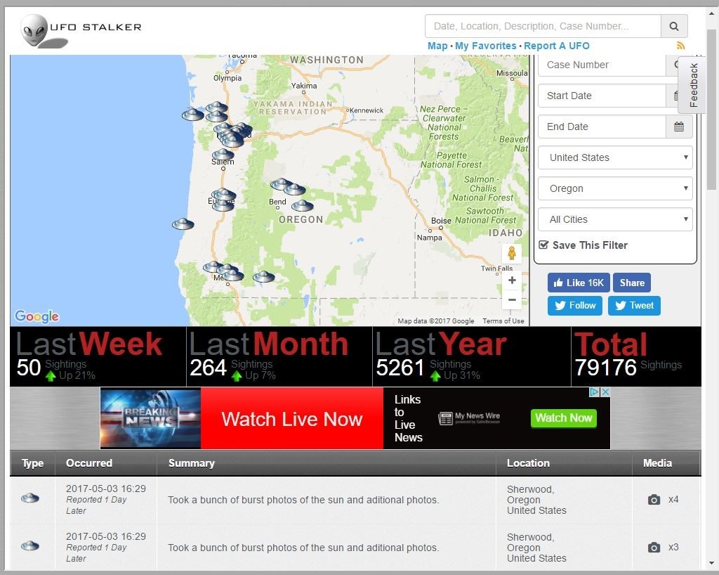
OpenStreetMap was created in 2004 by British entrepreneur Steve Coast in order to build a more detailed online map of the UK. By 2007, interest had grown enough to warrant an international conference called State of the Map, which was sponsored by Google and other companies and has since been a yearly event. That same year the U.S. Census Bureau’s TIGER/Line road data were imported, a major milestone since, first of all, previous road data were mostly created from users’ own recorded GPS tracks (very time-consuming) and, secondly, there now existed a road basemap covering all of the United States—until this point, most data in OSM was being added for Europe. Another important milestone occurred in 2010, when Microsoft’s Bing Maps granted OSM contributors the right to trace features using Bing aerial imagery (Yahoo!’s aerial imagery had previously been used for the same purpose but was inferior). I should add here that one of OSM’s principle rules is that content cannot be copied from other maps unless they are in the public domain. Having quality aerial imagery to trace is a huge deal. In 2012, Google started charging fees for websites that incorporate Google Maps within their own content, prompting a handful of notable companies and organizations, including Craigslist and Foursquare, to drop Google and switch to OSM (you may remember 2012 being the year Apple launched Apple Maps, which uses OSM in part). Today more and more companies, organizations, and websites are taking advantage of OSM not only for its free and open geospatial data but also for its increasing detail, accuracy and up-to-dateness, not to mention its real-time editability. The Future’s Best Interactive Map? If you haven’t looked at OpenStreetMap, scroll up to the top of this post where you will find it embedded. Take a moment to zoom in and out, pan around and examine the details in Portland. Due to the interest, care, and dedication of the community of contributors, we have a much superior interactive map compared to the ubiquitous Google’s (though areas that are sparsely populated tend to be sparsely mapped in OSM). I think that we will become more and more familiar with OpenStreetMap as time moves forward. Wikipedia has shown that an open and community-created and maintained encyclopedia can only get better and better as it grows. Humans have shown that access to vast, accurate, and up-to-date encyclopedic knowledge for everyone is an important priority that we are willing to work together on. Because we live in a spatial context and need to know where things are and how to intelligently move around, I hope that access to this “living” and dynamic community-generated map proves to be a priority as well, possibly resulting in the greatest interactive reference map yet. Written by Kayla Tomlin Have you seen a UFO? And if you did, what would you do about it? MUFON (Mutual UFO Network) is a scientific research organization that conducts scientific investigation of UFO’s for the benefit of humanity. They host a clever map that shows UFO sightings from all over the world, and allows you to enter your own sighting along with supporting evidence like photos, drawings and videos. I spoke with Tom Bowden, the Oregon State Director of MUFON (Mutual UFO Network) to ask him a few questions about the interactive map and who created it. He said they hired an organization called UFO Stalker to make their map, and admitted that geolocating these anomalies can be problematic. Many people may not know their exact location during the sighting, much less the exact location of the UFO. If they don’t know what city they are in it could be recorded by county, state/region/province, or they may only know they saw a UFO in Paraguay! Here’s a shot of the map that has some fun interactive features that show the point data as UFO’s of various types (saucer, black triangle, or an alien face for alien encounters!) falling from the sky when you pan and zoom. There are popups that display a summary of the sighting, as well as a table summary below the map of the sightings within the view.  There is also a search feature that lets users search for sightings by date, location, or MUFON case number. I got ahold of the author of the map and his name is Douglas Bell, but he lets me call him Doug. Doug saw a “data source that was ripe for visualization” when he offered to create this map for MUFON, but Doug has admitted he has never actually seen a UFO himself. He appended the MUFON data to include additional statistics such as local weather conditions at the time of the sighting, and through his analysis he reports there are distinct patterns that have emerged. He said one clear trend is the fact that highest volume of UFO’s sightings occur on days when everyone is outside looking up on July 4th and January 1st. Doug describes how he created the map using AngularJS and JQuery, Google Maps with custom overlays, and a Java API that serves the data to the presentation layer via Tomcat. Behind the scenes there are Java microservices that handle actions like data collection, correlation, and tweeting. His data sources come from a MySQL database, with local data stored on a Mongo database for caching and speed. Doug has created other interesting maps including one that geolocates IP addresses to aid police in locating stolen computers, a housing map that mines data from sources like Craigslist and Oodle allowing the user to search by amenities, as well as a garage sale and Wi-Fi hotspot locator for use on iPhone/Androids. If anybody could find aliens, it’s Doug. It’s just this type of inquisitive and talented mind that will make up the alien hunters of the future. These emerging UFO datasets could reveal the secrets that Giorgio Tsoukalos would kill for. Don’t forget to look up! http://www.mufon.com/live-ufo-map.html Written by David Kelly I have two opinions regarding Web Coding:
With that, I offer a few tips on basic HTML5 syntax and some keyboard shortcuts that will make the struggle a little easier. And I highly recommend spending some time at https://www.w3schools.com/html/; this is where I learned most of what I will share. Organization: Web coding terms like tag, element, block, article, section, and span all refer to a “container” that can be empty, or have any number of “containers” inside. Commonly referred to as nesting, web page organization is essential to correctly display text and images, and can metaphorically be described as a sandwich, a set of space-saving Tupperware, or a topographical map.  Where to start: The first thing is to create a file with the .html extension. I found Notepad++ to be very helpful because it recognizes web code file types, and colors the text according to purpose. The beginning of your code should:
The <head> section: Metadata and references are in the <head> section. The code in the head section is not displayed in the browser window, but is used for recording information and characteristic presets that can be accessed by the writer and user, alike. An example of metadata follows: The <head> is also where “Internal” Cascading Style Sheets (CSS) code can be written for use by any of the webpage elements in the <body> section. You can predefine the text for headings, paragraphs, and links, as well as, the size, border, and spacing of your HTML containers by defining classes in a <style> section inside the <head>. All elements have default styles, so CSS in the head section is not needed for a page to display. The <body> section: This is where all the visible pieces of your web code go. The <body> is described with a left-to-right, top-to-bottom method; that can be measured in units of pixels or percentage. There are a few ways to arrange the content of your webpage:
There are many layout templates available, from basic to complex, and in numerous themes. But you need to have a little experience to change the template’s contents and make it your own. It can get complicated very quickly, so I recommend starting simple. A good source for layout templates that use CSS is, again, w3schools: https://www.w3schools.com/w3css/w3css_templates.asp Basic Syntax: Now to some of the nitty gritty details of how each element can look. <tag attr1=”value” attr2=”value” style=”prop1,prop2:value;”>content</tag> Explanation: Here is a cheat sheet of HTML5 element tag names and descriptions: https://websitesetup.org/HTML5-cheat-sheet.pdf W3schools has a nice reference site for tag names, attributes, colors, and everything HTML: https://www.w3schools.com/tags/default.asp Keyboard Shortcuts: While working on web code, switching between windows and tabs is a constant, so here are a few shortcuts I used all the time: Here is a link for more keyboard shortcuts from w3schools:
https://www.w3schools.com/tags/ref_keyboardshortcuts.as Written by Sarah Dewees
So I'm not a computer person and I don't know code, but I want to make maps that people can interact with. And so far my foray into web mapping has left me a bit lost. I need to know a new language or two ( Java script, css, html) and even some of the words that are in English don't make sense. There seem to be few programs out there to help us illiterate folks code, but you have to be able to get your data onto their server. There are so many file types available and at the same time so many that are unavailable. The questions I hope to answer for myself and graciously share with you are; which file type is best? and how to convert from one file type to another. Supported Web mapping file types: Below are a list of file types that I could upload to Carto, Mapbox, Google My Maps and ArcGIS online. There are probably more but this seemed like a good baseline. These are also all less code required sites.
After lots of looking there does not seem to be one universal file type with web mapping. I didn't really expect there to be, but wanted to check. GeoJSON seem to be pretty popular in web mapping since its already in Java Script and many of the web mapping libraries are in Java Script. Unfortunately, in my experience GeoJSON files gave me the most trouble to create. ArcMap only converts to .json files which give me an error in Mapbox (and possibly others) that I can't figure out how to fix it. So how do I get to the elusive GeoJSON.... Transforming one dataset into another - its magic! Without using code Unfortunately this does not work with raster data you must first convert to a vector format for uploading. Using Carto - Ok, so you can upload lots of different file types into Carto and then download (click on the dataset, then export) them as a .geojson or KML (also csv and shapefile). The only problem I found with this so far is that while your data is on Carto, unless you have a paid for account, the data is public. There doesn't seem to be a limit to how much data you can upload to Carto and you can delete it afterwards but if your data is sensitive this might not be the best plan. Using QGIS - Bring data into QGIS, right click on it and go to 'save as', then select geojson and make sure all parameters are appropriate and save where you want it. If you need to edit it convert after editing as QGIS cannot edit geojson. These are the only non-code methods that I have been able to find that work for me. Please share any methods you find or know of for file conversion! |
AuthorBlog posts are written by students in the Interactive Map Design course at Portland Community College. Archives
June 2018
Categories |




 RSS Feed