|
Written by, Mathew Sisneros
Ever since I was young I have been into all things historic and prehistoric. At an early age I discovered the wonder that was ancient Egypt and from then on I was hooked. In college I pursued anthropology and focused heavily on Biological anthropology and Archaeology. Once into the field of Cultural Resource Management within archaeology, I discovered GIS applications and how heavily they rely on GIS and GPS for geocoding sites and navigation to areas where we might discover sites. It was only logical that I would then follow up my archaeology degree with a GIS certificate to dip into both fields that interest me so very much. This interest in history, the past, and now mapping these things on a modern landscape brought me to a Next Exit History booth during the 2015 Archaeology Road Show put on by Portland State University. Next Exit history is a web based map application that maps things of historical note based on your current location or which state you click as your selector within the web map embedded on the website. This map application was designed by Historical Research Associates (HRA) and the University of West Florida (UWF). Next Exit History has over 60,000 historical sites, landmarks, parks, etc. mapped on a Google map and you can select these points and be transported to a webpage describing this site, a map showing its location, some photography about the site, and even some audio recordings introducing the site to the viewer. Here is an example from right here in downtown Portland: http://nextexithistory.com/site/national-historic-landmark-pioneer-courthouse/ You can also create “Backpacks” which are tours that are centered around a theme or particular historical event. It will only pull up the sites and landmarks associated with that theme, as if it is its own separate layer that would be selected in an ArcGIS program. For example here is one centered on the American Southwest: http://nextexithistory.com/backpack/american-southwest/ As an archaeologist, I find this extremely useful in at least introducing the general public to aspects of history and archaeology that may not even enter their sphere of influence on a given day. Also this can help introduce future generations to these sites and help people to understand the importance of history and archaeology. These types of documentation within this map application can also get the public cognizant of that wealth of historical and archaeological data and even demonstrate the need to preserve and conserve these sites from potential damage due to development or climate change. If you are interested in history or archaeology, like I am, then this app is definitely something to consider adding to your smartphone library. http://nextexithistory.com/
3 Comments
Written by Erica Williams Expertise in creating functional, aesthetically pleasing maps online is indispensable. A well put together map is informative, interactive, and accurate, perhaps using a suite of mapping libraries to provide extra functionality and cartographic features. However, the most technically competent and user-friendly map will never be able to have an impact if no one ever sees it. Creating maps in an online environment often means you are responsible for promoting those maps. What is a cartographer to do? FIRST: WHAT IS YOUR MAP? For the purposes of this article, I will be using as an example an ESRI ArcGIS Online Story Map, created for a lab earlier this term. As always, ESRI technology has its own quirks and peculiarities, and I will try to point them out when possible to make this example as general as I can. The map in question can be found here http://arcg.is/20toUpF 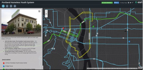 STRAIGHT FROM THE HORSE’S MOUTH The first place someone seeking to promote their web map should look is the site of the tools they used to make the map in the first place. ArcGIS Online has some advice in that regard. As the creator of a story map I have the opportunity to change the tags and description of both my map series, and the individual maps. By clicking on the story map you wish to promote, you should encounter a page like this 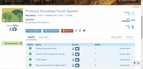 Here you can find a summary field, a tab to insert tags, a share button and links to edit each individual map. No matter what application you are using to construct your maps, these elements, or versions of them are very important, as we will see below. In addition the ESRI help files recommend making use of a feature called “groups” in the promotion of your content: http://doc.arcgis.com/en/arcgis-online/share-maps/groups.htm There are also myriad websites with advice for how to promote any kind of content on the web. For the purposes of this article, I will be following along with the advice presented in this article, because it tickles me to promote free services for homeless kids using resources from a capital-oriented website intended to hoard more and more money privately. SHARE AND SHARE ALIKE By clicking on the share button (the little picture of chains) for my story map, I am presented with a pop-up like so (assuming your map has already been made public): 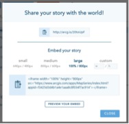 Here you will find not only a link to the story map which can be given to others directly to access your work, but also the html code necessary to embed your map into an existing webpage, a very good idea! Ensuring that whatever API you are building your map in has its sharing settings put on “public” or the equivalent will save you much confusion. Again, sharing links and html codes exist for all my individual maps as well. This is important, because drawing people into a website is one of the most effective ways to get eyes on your work. SEARCH HIGH AND LOW I first want to focus on that summary field and tags tab. These are intensely useful for what is called Search Engine Optimization, or the process for being a search result when someone enters a query in Google. Tags and descriptions, minor items which might get the short shrift in metadata for a non-interactive map, become of utmost importance when you realize that most search engines looks only for text to match with people’s queries. My summary and map descriptions should thus take into account which searches I hope to come up in the results for. I want the information I have organized to be available to people asking, “Where can I go to get (shelter, food, showers, etc) as a homeless (youth, child, kid, young adult)?” Houseless, in trouble, somewhere to stay, help, are all words I expect that people will use to describe their situations. My summary then can be something like, “Are you in trouble and a child in Portland? If you are in need of a shelter, of food, of a shower, of clothes, of medical care or just a place to rest, and you are a kid, a youth, a teenager, or a young adult, then these maps can help.” The repetition of words is something that you should aim for. Not just the series, but each individual map can take a similar description in its metadata. Click on the edit map buttons of the screen shown above. Go to the details tab highlighted below, and add descriptions which are likely to answer questions your maps might be useful in response to: 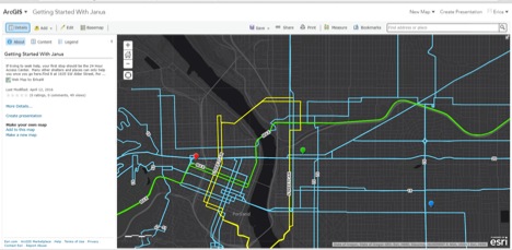 Next we should talk about tags. Essentially “pull words” which can link your content with search engine queries, tags are familiar to many people these days as hashtags on Twitter or Facebook. Using similar principles as before when writing up summaries should get us a tag list that is helpful. 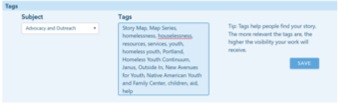 Now that the map is well-configured, it is time to worry about how to make the site it appears on more accessible to search engines. Ensuring that the site you post it on is properly indexed, or readable is paramount. If your site is hosted by a service such as Mango, or any popular blogging site, they should submit your sitemap automatically to be indexed. GET BY WITH A LITTLE HELP FROM YOUR FRIENDS One of the surest ways to promote your web map is to give access to it directly to those with whom you have professional or social ties already. We live in a culture of social media, and this can be a powerful tool for anyone producing content online. The ArcGIS Online Groups are essentially ready made professional and social networks for other cartographers to view your maps. Your map can be shared to public groups, or you can create your own. 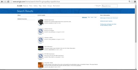 However, if you are producing content intended for those who are not united by an interest in web maps, or which does not use ArcGIS Online as a base, your own social networks can help. Facebook groups exist for nearly any community, and there is ample help for promoting a group you yourself have made. Targeting your content to people who have an interest in sharing it has the potential to promote your web map to hundreds of new users with each successive link they share out.
IN CONCLUSION As cartographers, we are story-tellers. Getting an audience is the only way that our stories get told. We can help ourselves and the readers of our maps by making sure that our maps are accessible, by ensuring that those asking for them can get to them, and by directly telling people about our work. SOURCES AND RESOURCES How to Get Your Web Maps to the Top of Google Search 4 Ways to Increase the Visibility of Your Web Map 10 Proven Ways to Market Your Website ArcGIS Online Help: What Is A Group? Essentials For Intelligent Web Maps 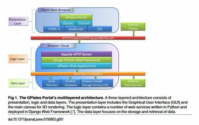 Written by Ken De'Ora
About 5 years ago, after some positive experiences with GIS in the field as an archaeologist, I began exploring the potential for a new career revolving around interests in understanding the inner-working capabilities of mobile technologies, and the way they assist information management. But before jumping right into the GIS certificate at PCC, an influential internship in historic preservation provided me with insights into how indoor mapping and modeling could stand to be more efficient. Painstakingly measuring architectural details can be slow going without the right tools, and if you miss a deadline it can affect your project negatively. Along with this problem, not being able to share my data the way I wanted to, took considerable attention away from peers I wanted to have review it. To be specific, at the time I finished my work, the most efficient way to share it was either to pay for a larger amount of space on a service like DropBox to host my report, or I could just pay Kinko’s to print it out and I could mail it to them. Because of this scenario, within the context of our class on web map design, I figured talking about new developments in web sharing and storage of LiDAR data could be appropriate. For some time now, companies like Autodesk and FARO have had their own scanning software for users (such as ReCap 360 and SCENE) to be used in conjunction with LiDAR instruments. Customers like NASA, Volvo, Johnson and Johnson, and others, use them for creating “as-built” data (data that’s finished being messed with and ready to be built), for mapping, and for asset management or project execution, which tend to require quite a bit of space on a drive. Until recently, that meant putting it on the web was more time consuming and costly, because those customers would have to own and maintain their own internet servers to host their individual projects. But today, progress in cloud-based hosting has allowed FARO, Autodesk, and even smaller companies, to host the servers for their subscribers securely and increase the customer accessibility of very large datasets, like point-cloud information. Because of cloud-based data storage, computers can access data entirely from within a web browser. And not only do most cloud-based environments allow for storage but many of them allow additional functionality to be able to do things like access libraries and caches to add to your project and customize the image. The only downside is that these are obviously for profit companies, so their instrumentation is expensive as is there software. There is open source and open access software out there, but what I found was only for geophysical and geological data, exhibiting interactive topography, but primarily for plate tectonics. Also, since they’ve been compiled by academics, not marketing geniuses, they don’t seem intuitive. However, the hosting and software architecture for them is interesting to explore. Briefly, Cesium is an open-source 3D processing AND cloud-based hosting environment that, along with JQuery allows GPlates Portal to present their data on plate reconstructions. Cesium uses a Javascript library that is built off a derivative of OpenGL 3.3 (called Web Graphics Library) to produce interactive 2D maps and 3D globes in your browser. Your browser can then access the WebGL API as a Document Object Model, which then interfaces with HTML5 and CSS elements to allow for a faster 3D image to render. All of this is based on logic and data layers (such as a python framework, HTTP server and GIS datasets) which rest in Amazon’s cloud system. I can only assume this is how FARO and Autodesk do it as well, but slight differences, with much broader flexibility to their functionality and for a much smaller scoped project. Ok, that’s all I wanted to say! Sorry this is so long. I sort of didn’t know where to stop. Or what would be interesting, or dry. Hopefully, these following links will address anything I missed or satiate any curiosity. http://www.spar3d.com/news/software/vol14no10-faro-releases-scene-webshare-cloud-2-0/ http://www.autodesk.com/products/recap-360/overview https://cesiumjs.org/ http://portal.gplates.org/ Müller, R. Dietmar, et al. "The Gplates Portal: Cloud-Based Interactive 3D Visualization Of Global Geophysical And Geological Data In A Web Browser." Plos ONE 11.3 (2016): 1-17. Academic Search Premier. Web. 9 Apr. 2016. |
AuthorBlog posts are written by students in the Interactive Map Design course at Portland Community College. Archives
June 2018
Categories |
 RSS Feed