|
Written by Lindsay Cumella We as GIS professionals know that it is the information which we attach to our spatial features that deserves the focus. And while some data are objective, many are subjective, dynamic, and personal. How the latter category of data is generated and by whom can be incredibly important, as a recent issue with a project called Queering the Map highlighted. Queering the Map began in Spring 2017 by design student Lucas LaRochelle in Montreal, Quebec after they biked past a spot that held a memory about a past relationship. Rather than publish this information in any other forum available on the internet, LaRochelle chose a map. They chose to present the information in spatial terms, leading to a publicly modifiable Google based interactive map, which quickly became home to a collection of location based queer stories from around the world. Upon hearing of the project, I assumed the map would contain features like gay bars, community resource centers, queer owned businesses, etc. But the entries are much more personal and diverse, from people marking the places they came out to now extinct gay spaces to the locations of intimate relationship moments. The experiences also represent a greater breadth of the queer community, with a greater percentage of stories than are usually seen in mainstream coverage of the LGBT community coming from people of color, people in rural areas, and people pushing against gender boundaries. This result represents the ideal of what can be achieved by an interactive map; crowdsourcing spatial information can build new pictures that change our understanding of what happens where. 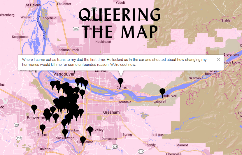 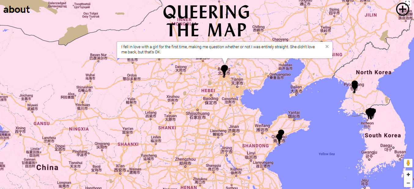 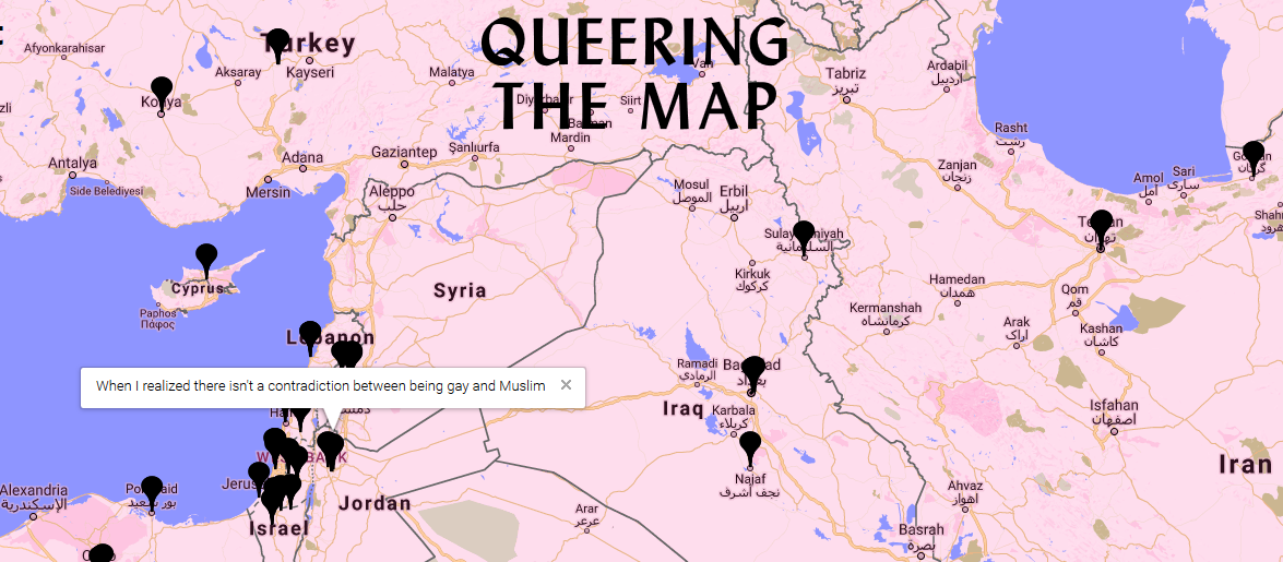 When the map was spammed with thousands of pro-Trump messages in February 2018, the site had to be taken down. LaRochelle, a designer rather than someone in the GIS field, drew upon the expertise of volunteer coders and web security professionals to re-secure the website. It went back up just earlier this month, April 2018, with added security features, some of which are necessary to safely maintain the original idea of the map story project and some of which necessarily push back against the completely open nature of public contribution. The site, for example, no longer collects any of its users’ geodata, which means practically the site always opens centered on Montreal, but also protects users in countries and regions of the world in which it is still dangerous or even illegal to be gay. A panel of moderators also monitor the entries for obvious trolling and language of many -phobic varieties. These individuals have the common on the internet, but near impossible, job of defining boundaries that are not universal and most likely in flux, e.g. what counts as hate speech or who is included under the ‘queer’ umbrella. Currently, the Queering the Map Project aims to keep the latter definition completely open regarding who can add spatial information to the map. “Whatever constitutes queerness or queer action, or queer space, or queer geography counts for this project,” LaRochelle said. As GIS professionals, I think this situation highlights the challenge we face specifically while creating and maintaining interactive maps which are based on collaborative data entry. We must choose how to solicit, collect, classify, limit and censor the information around which our maps are centered. Choice of features, both interface and security related, must be evaluated to protect primary voices around the subject matter when the map is not meant to reflective purely objective data. The queer community is only one example of a realm undergoing active and dynamic change, and how we map information relating to those realms needs to include a balance between broad representation and security, one which respects that changing nature. 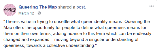
3 Comments
Written by Nicole Elsmore Stumbling upon the National Geographic’s MapMaker Interactive seemed like a fortunate thing, and inside I squealed with glee. The splash screen promised country facts, coordinate data, and customizable map features. 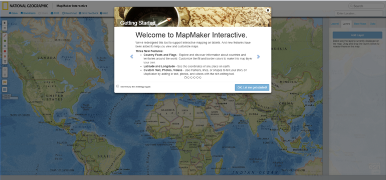 Unfortunately, my experience only went downhill from here. Behind the splash screen stood the ominous, hideous transverse Mercator world projection. The program allowed me to zoom out and scroll through the infinite world and also allowed me to zoom in to the point of the map breaking into gray tiles reading “Map Data Not Yet Available”. Although the Nat Geo data layers displayed consistently throughout the infinite world, any data I added stuck to only one iteration. 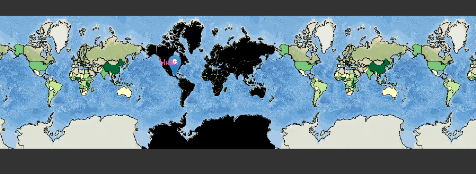 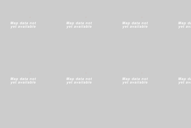 The datasets provided by Nat Geo were viscerally the most interesting aspect of the MapMaker. They provided a few dozen datasets, with everything from “Sweet Potato Production” to “Big Cat Territories”. While these datasets were inherently interesting there wasn’t much I could do with them. Altering the transparency of the layers was the only “analysis” tool available. A promising tab labeled “data” on the right-side menu remained blank in spite of my desperate poking and prodding and this tab’s lack of functionality proved the biggest disappointment of MapMaker. The “legend” works as expected, providing the range of data values represented in the layers. The familiar capabilities to add your own points, polygons, and text to the map, to create bookmarks, and to save and export your map, are comforting but lackluster. One positive is the ease with which map layers are re-ordered. Once you enable the country flag and fact ability, clicking a country enables a pop-up that provides a brief country description and provides a list of facts, a charming but un-inspiring feature. Many of the text pop-ups providing information on data layers and countries ran in one big, long sentence that spilled off the screen making them difficult to read.
Essentially, National Geographic Interactive MapMaker is a data visualization tool that allows for comparison of datasets using the transparency function. Besides having some unique datasets and the National Geographic brand name, MapMaker is a poor representation of the capacity of interactive maps. Written by Steve Lantz Social explorer is a web based mapping platform that aggregates U.S census data as well as from other academic and private institutions. Social Explorer has won many awards for its webs maps. Awards include WMA standard of excellence and the Gold Award from the Modern Library Awards. The clients of Social Explorer include but not limited to the New York Times, Stanford University, Yale University and Target. 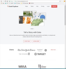 You can start using the data by clicking on “Start now” tab. The web maps that Social Explorer creates are extremely intuitive and easy to use. By default, it starts out at a national scale looking at population density from the most current census. To change the data that is being displayed click on the “Change Data” tab to open a drop down menu. Within the menu there are many different types of data that can be mapped. Some of the different types of data that can be mapped include education, house value, health as well as many other categorizes. Again some is limited in the free version. 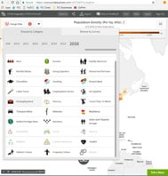 Additionally, the user can easily switch back and forth between the two maps the user is looking at. There are two different options for comparing two data sets. There is the “swipe” version. In that mode you can move the cursor and slide it from side to side to gain a better idea of the difference and similarities between the two maps. 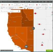 |
AuthorBlog posts are written by students in the Interactive Map Design course at Portland Community College. Archives
June 2018
Categories |
 RSS Feed