CHRISTINA FRIEDLE
  • Home
  • About Me
  • Courses
  • GIS Club
    • About Us
    • Don't be a Dangle!
    • Event Calendar
  • Resources
    • Data
    • Tools
    • Blogs
    • ArcGIS Install
  • Blog
  • Aventuras Colombianas

5/24/2016

Cromwell’s Down Survey, and The Imperial Pursuit of Cartography

3 Comments

Read Now
 
Written by Robert Mannering

Inevitably, any history of an Empire has to fundamentally contain a history of the people within that Empire and how the subjects were managed.  Increasingly, the history of cartography as a field has developed to explain the identity of Empires; and the study of systems of management and control has led to a better understanding of how early modern societies worked and what life was like within them. 

At http://downsurvey.tcd.ie, Trinity College in Ireland has georeferenced an incredible amount of data from 17th Century post-Tudor England and displayed the results in an incredible series of webmaps that bring to life a fascinating GIS project from the 1650s.  But before getting into that, it’s worth considering what led to the historic survey in the first place over a couple of paragraphs of “pub history”.

As is the case with most islands, the earliest patterns of urban development in Irish history can be observed along the coastline.  While the traditional Gaelic clans and tribes kept to forested inland regions, Ireland’s Viking cities played host to an ever changing cast of invaders and settlers beginning in the 8th Century.  This culminated in the Norman conquest of England in 1066 which soon led to a permanent Anglo-Norman settlement in Ireland. 
Generations of trade, inter-marriage and cross cultural assimilation between the ‘Old Irish’ Gaels and the ‘New Irish’ Normans gradually created an Irish-Norman identity unique to that of their distant cousins in England.  Land hereditary practices, clan-based political systems and religious ceremonial procedures created a new Norman identity.  However, crucially, the character of this identity remained loyal to an English crown that content to allow the New Irish to administrate the island in their name. 

Although this uneasy set-up waxed and waned over time, it nonetheless persisted until the English Reformation.  The establishment of a Protestant Church of England by Henry VIII triggered a century of warfare over the English throne and the religious identity of the British Isles.  Eventually, following the collapse of the last of Irish military opposition to English rule in the mid 1600s, the remaining Norman lords fled to France and the securement of the English Crown in Ireland was completed in 1652 with the passage of The Act for the Settlement of Ireland by British parliament..
The vacancy left from Norman landowners who had left, combined with the urgent need for loyal landowners to take their place, led to a systematic expulsion of ‘Old Irish’ and ‘New Irish’ from their land and pushed their presence to the barren reaches on the west of the island.  In their place, land was gifted out to loyal English soldiers and noblemen.  The complete resettlement of the island in turn brought with it a completely new system of management leading to the British Empire conducting possibly the first GIS project on a national scale to map and record the scale of land ownership change that had taken place over the previous decades.  This soon became a trend, and into the modern era, Ireland became the subject of some of the most rigorous cartographic practices in the world at the behest of an Empire desperate to control and manage some of its most difficult possessions. 

Today, Trinity College’s  webmaps detail not only the scope and depth of Irish Ordinance Surveys across the centuries (including a groundbreaking 20 year survey in 1824 that produced maps for the whole island at a 6 inch scale of resolution), but also create an interactive archive that shows on a modern web map of Ireland where historic land parcels were located and tied to the details of the title holders who owned them.

There are two main components to the website.  The first is a digital series of all of the maps originally created for the crown which can be panned and zoomed across. 
Picture
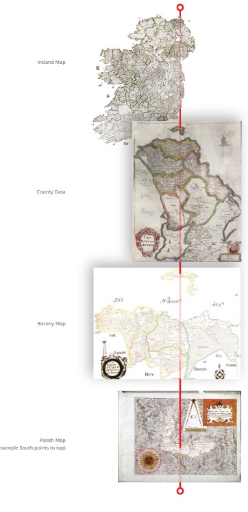
The above graphic shows the 4 levels of scale that the Down Survey created in 1641.  Starting with an overall map of the Island, surveyors then made sub division maps for each county, baronies within each county and parishes within each barony.
 
The second aspect of the site is a webmap that has all of the archived Down Survey information geo referenced to open streetmaps.  This map can be queried for entries in the original survey and it will deliver the results in their modern location.
Picture
Picture
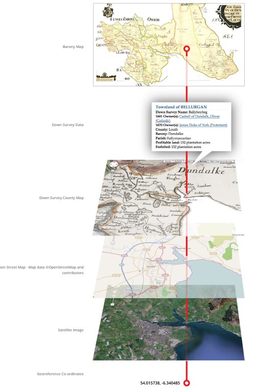
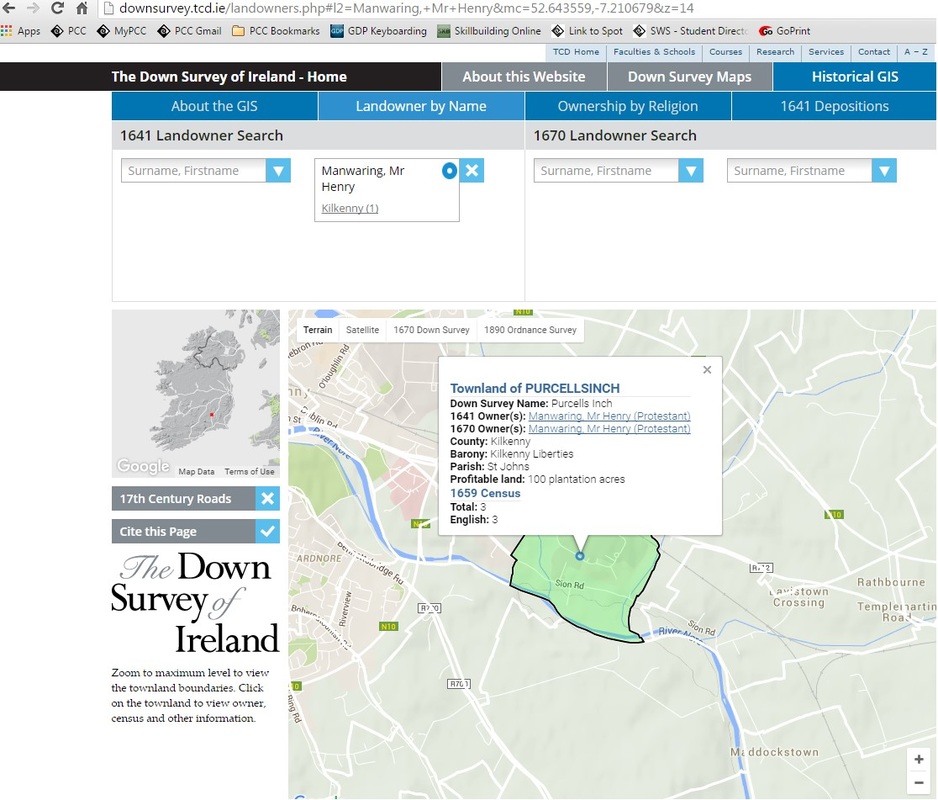
He’s named like my name!
 
A couple of other points of analysis are on the site too, such as a 17th century crime map based on archived court depositions as well as a comparison of landownership between catholics and protestants, pre and post Oliver Cromwell:
Picture
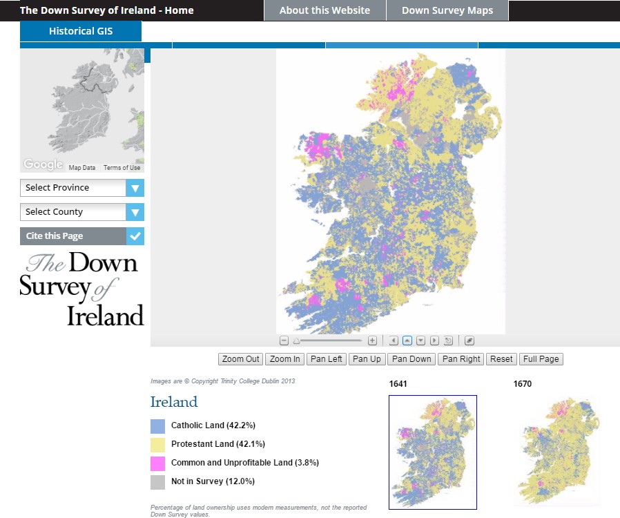
Spatial evidence of Oliver Cromwell not being a celebrated figure in Ireland.
 
So, there it is.  Historical cartography. Pretty nifty. There’s a huge archive of geo-referenced historical maps from across the world at http://www.davidrumsey.com/.  Also, http://www.washmapsociety.org/ is a historic cartographic society that publishes a quarterly journal a lot of historical aspects of maps and how they were built and used across the ages.  If nothing else, it’s probably a good topic of conversation during a job interview. 

Hope you guys are into it!

Share

3 Comments

5/20/2016

Eyes in the Sky

3 Comments

Read Now
 
Written by Benjamin Arp

There is a literal world of opportunity when it comes to drone usage that we, as a society are just beginning to recognize. With this technology becoming more feasible technologically and financially, we are on the cusp of a virtual revolution. Imagine: on-demand aerial photography, LiDAR, and video footage in ultra high resolution! 

In my essay below, I focus on the benefits of drone usage in agriculture, and how exponential usage can be overcome with simple tweaks in regulations. Furthermore, drone usage can be extremely beneficial and interactive in agriculture. Web maps can be created with immediately acquired data and shared by the crop manager/analyst with landowners, farmers, share holders, investors, and even customers-- all in near real-time! 

This is a minute example of potential, but is vast in itself.

Eyes in the Sky

For the past decade and a half, drone technology has been an issue of heated debate. Sure, the possibilities for malicious use are apparent and in abundance; but so are the possibilities for beneficial use. In fact, the potential of UAV’s, or unmanned aerial vehicles, is so great and should not be taken for granted. We have seen UAV usage for film and television to capture aerial interludes. We have seen those little robots flying around the football field during televised games to capture fantastic angles. We have heard about drones being flown to carry out military operations. What hasn’t been mentioned on a majority scale is the potential for more localized use to increase efficiency in emergency services, agriculture, survey, and geography. The case for commercial use does not come without argument, especially in agriculture. While most commercial remote sensing has relied on satellite and airplane imagery for their analysis, the possibility of UAV imagery is greater than the aforementioned in most all aspects. These arguments consist of cost, time, availability and attainability, weather, and resolution. To unlock this potential, FAA restrictions must become more unfastened on commercial usage.

Dependent on use, there are different types of UAVs available to operate. When this technology was first implemented for military use, the prototype was a fixed-wing machine that resembled an aircraft at a fraction of the size. It makes sense to require a pilot license to operate one of these, as it has the capability to cover great distances at very high altitudes. With these variables, experience must be required to handle different weather conditions and avoid interference with other airborne operations. The more easily accessible and simple to operate type of UAV flies on rotors, like a helicopter; but these units typically have four to eight rotors, with the most popular type being the “Quad Copter”(Esler). Rotary UAVs are used for very localized applications, and are much more cost-effective. They cannot reach the altitudes of the fixed-wing UAVs, nor can they cover great distances, but their ability to capture ultrahigh-resolution imagery with easy operation makes them an ideal instrument in most any commercial field.

Most applications involve the intention to gather image data in the form of near-infrared (NIR), thermal, multispectral or hyperspectral, or LiDAR (light detection and ranging), and then geocoded with GPS coordinates for various geospatial analyses. UAVs are now being programmed to return to the takeoff point if either the battery runs low, or the signal between unit and operator is lost (Esler). Also, specified “no fly zones” are programmed so that drones do not cross those coordinates under any circumstance without approval. Both types of UAVs can achieve high-resolution imagery; fixed-wing units have camera capabilities of up to 2-3 cm per pixel, whereas rotary units can capture resolutions finer than 2 cm per pixel (Thomas).

Currently, the restrictions for recreational UAVs are very lenient, and there are many instances of interference with commercial UAV operations, as well as interference and collisions with aircrafts. As long as they are flown below an altitude of 400 ft. and outside of a five mile radius of any airport, recreational or “hobby” UAV operators can do as they please (Wehrspann). This is becoming furthermore concerning because these machines are fairly inexpensive to purchase, with prices starting from $600, and they are simple to operate. The concept of operating a UAV is very similar to that of one of those remote control cars one would find at a toy or hobby store. To throw in another controversial wrench in the gears, most recreational UAVs are undetectable by air traffic control radar (Wehrspann).

For commercial and professional operations, there are many restrictions, including the requirement for a Private Pilot Certificate and a Class III Medical Certificate. According to John Stowell, in his article “Attack Of The Drones,” there is an exemption, FAA Section 333, for UAV operation certification, where “the operator must essentially provide a business plan to the FAA showing how and for what purpose the drone would be used”. Stowell, optimistically yet realistically, points out that “the process is slow and arduous.” Any unit over 55 lbs. must have a certified operator, no exemption. Units must NOT be flown after dark, above 500 ft., within 5 miles of any airport, in any designated classified airspace without permission, faster than 100 miles per hour (87 kt), or out of line of sight. If FAA regulations eased, many more jobs could be created and potential use would flourish.

Agriculture, on the whole, could benefit most from UAV technology. That is not to say that any other area of operation couldn’t benefit greatly, but the amount of finite possibilities of analysis in agriculture could improve efficiency in every aspect, exponentially. The use of multispectral and hyperspectral sensors on remote controlled units with the highest resolution possible can give thorough answers to crop health, species differentiation, weed identification, disease, plant stress levels, yield potential, and chlorophyll content, to name a few types of analyses (Collings). Rather than relying on satellite imagery of 10-30m resolution, or airplane derived imagery of 6 in. to 3 ft. resolution that is either only captured once or twice per month and is expensive to retrieve, a UAV can be flown once or twice per week on demand without fuel or operator costs. With UAV derived imagery, retrieval is much quicker, resolution is far greater, coverage can be specified through programmed GPS coordinates, a specialty operator doesn’t necessarily need to be hired, and the worry of cloud interference is nonexistent.

Not only does agriculture have endless possibilities in analysis and efficiency, but the field is also projected, once restrictions are one day lifted, to capture approximately 65% of UAV sales. According to Cary Blake, in the article “Agriculture to Farm 2/3 of UAV Market,” the use of drones will positively impact water efficiency, locate pests and diseases, and determine plant health and soil types by combining and analyzing different bandwidths in imagery. With this technology, pesticide use will be all but extinct, as UAVs can spot spray and use very little. Currently, the cost of renting and airplane, pilot, fuel cost, and the abundance of pesticides to dump on crops jeopardizes the quality of the product and the budget and health of the consumer. 

There is a world of possibilities at our fingertips with unmanned aerial vehicles. Through ease of use akin to operating an RC car, lower costs versus that of airplane photography in every facet, and endless available uses, there is hardly any argument against the use of UAVs. If the FAA were to reverse the roles of regulations between commercial and recreational rotary drone usage for units lighter than 55 lbs., efficiency and potential will flourish. With the right photogrammetric technology, we can see the things we cannot see with the naked eye. The potential is just beginning to be grasped, and agriculture is at the forefront of this technological revolution that will drastically improve efficiency of crop management and the health of the consumer. We have the potential to see through a new lens, so to speak, at our planet on many different levels. The rise of UAVs will be our eyes in the sky. 

Works Cited
  • ​Blake, Cary. "Agriculture to Farm Two-Thirds of UAV-Drone Market." Western Farm Press 1 May 2015.Agriculture Collection. Web. 15 Mar. 2016.
  • Collings, Andy. "Drones Could Bring Benefits To Arable Farmers.” Farmers Weekly 159.6 (2013): 51. MasterFILE Premier. Web. 3 Mar. 2016.
  • Esler, David. "Drone Revolution." Business & Commercial Aviation (2015): 50. MasterFILE Premier. Web. 3 Mar. 2016.
  • Stowell, John. "Attack Of The Drones." Cincinnati Magazine 49.3 (2015): 68. MasterFILE Premier. Web. 3 Mar. 2016.
  • Thomas, Chris. "Send In The Drones." Public Management (00333611) 97.3 (2015): 16. MasterFILE Premier. Web. 3 Mar. 2016.
  • Wehrspann, Jodie. "Drones on the Rise." Farm Industry News 21 Apr. 2015. Agriculture Collection. Web. 3 Mar. 2016.

Share

3 Comments

5/20/2016

The Emotional Aspect of Discovery in Web Maps

1 Comment

Read Now
 

The Emotional Aspect of Discovery In Web Maps
(Featuring The Interactive Ft. McMurray Wildfire Damage Map)

Written by Kyung Lee
​
In June of 1993, I boarded a flight at SeaTac International Airport bound for St. Louis, Missouri.  As the plane began to descend for landing, I looked out my window and marveled at acres and acres of freshly plowed fields stretching out to the horizon in every direction.  We continued to decrease altitude and I began noticing shiny objects spread all throughout the fields.  Were they water monitors?  Devices for scaring birds away from newly planted seeds?  Or maybe just natural mineral deposits?


A moment or two later, my gut dropped, and it had nothing to do with the altitude.  Those sparkly spots weren’t objects… they were reflections… of the sun… on brown, muddy water… as far as the eye could see.

Upon landing I immediately bought a newspaper and started reading about the Great U.S. Flood of 1993.  Nothing in print gave me that same overwhelming response—the moment of raw emotion that accompanies discovery.  I had never really experienced that feeling with a map… until now.
 
Web maps are used for a wide variety of uses: to disseminate information, to provide directions between locations, or to predict changes to the world.  One aspect that isn’t discussed much is the emotional aspect of discovery that accompanies interactive web mapping.

This is different than editorial maps intentionally created to evoke an emotional response.  Discovery is organic to the user, not the producer.  Static maps have already had their information culled and editorialized.  Hurricane Katrina or the Haiti earthquake of 2010 were also epic in scale, but the maps of those events presented very clinical facts of damage delineations.  They were informative, but still just lines on a piece of paper.  Web maps add the aspect of interactivity, which leads to discovery, which can instill an emotional response from the user.

The Ft McMurray Damage Map is provided by the government of Alberta, Canada, to provide information to the 60,000+ residents forced to evacuate due to a massive wildfire.  It interactively displays 50 centimeter-resolution images taken by Pléiades satellites. 
Picture
At its initial extent, nothing seems amiss.  There are no immediate signs of damage and it’s difficult to assess what has burned and what hasn’t.

​Zooming in three levels, we can clearly see where the wildfires had burned.  But at least the houses were saved.
Picture
​Hang on…
Picture
And there’s that gut-wrenching feeling.  You’re not seeing what you thought you were seeing.  The action of discovery, not the information itself, is overwhelming.  Conceptually, we know 2,400 structures burned in this town, but here we’ve hit that moment where it becomes real.

Discovery is what truly elevates web maps from their static siblings.  The same information packs more punch when the user can explore the map and gain their own sense of the scope and/or depth of the information.  Try to add a component of discovery to enhance your web map user’s experience, rather than just displaying a series of static maps.
 
Link to Ft. McMurray Damage Map:
https://cdn.albertamapservices.ca/FortMcMurray/Viewer/?Viewer=FortMcMurray

Share

1 Comment

5/16/2016

C-FERST - Community Focused Exposure & Risk Screening tool

1 Comment

Read Now
 
Written by Phil Paulson​

C-FERST stands for the Community Focused Exposure and Risk Screening Tool, which has been in beta-testing since the fall of 2013, and is projected be released in the Fall of 2016 or shortly thereafter. It’s part of a network of related mapping, data visualization and data portal applications in various states of testing by the EPA that include T-FERST, EJScreen, and EnviroAtlas. These tools serve as the backbone of the EPA’s push to provide spatial data about possible human and environmental toxic exposures to the communities where these exposures have, could and probably will occur, so that they can be more informed about their communities and take action to mitigate or eliminate threats to their health. The tool dashboard currently looks like this:
Picture
The mapping application is the introduction to the rest of the data and research interface, and is built with almost rugged simplicity; all of the data that it displays is publically available, the map is built in ArcGIS Online (you can sign in to ArcGIS, and are required to do so in order to add additional layers) with a Bing base map, and the cartography of the provided layers is utilitarian. The layer names are fairly opaque unless you have a familiarity with environmental law and ArcGIS naming conventions, though there are plans to address this concern before the public release.

​The Compare Tool provides a generally comprehensive list of the health measures displayed on the map by the zipcode and then provides data for the county and state that contain that zipcode, and national average for comparison rates:
Picture
The rest of the sections in the tool provide information (often in the form of links to websites) about how to collect additional data about the measures of environmental health and different programs that are available for technical and financial assistance in addressing these sources of environmental risk. Most of these sections also have Story Map examples of how to utilize and interpret the tool.

I began testing this tool as part of my Bachelor’s degree in 2013, and much of the structure that was in place at that time is still in place, but there has been additional information and explanation added about how to use each of the tools (largely through the Story Map examples). When we began the testing process, we were advised that this tool was intended for communities working with GIS and/or environmental science professionals. Given the layout and technical detail provided through the mapping interface and best practices research that is provided, I would say that this advice is sound. from the standpoint of a general user, the data is useful for starting a conversation, but requires significant GIS and scientific analysis in order to provide a concrete plan for action, likely through a local government.

Share

1 Comment

5/12/2016

The Interactive Web Maps We Make Everyday

4 Comments

Read Now
 
Written by Mike Holscher

So I was checking out the sidebar menu in Google Maps the other day and came across “Your
Timeline.” Now we all know that both Apple and Google track the Hell out of everything we do
with our electronic devices, but this is very interesting. We all signed up to learn how to make
relevant interactive maps and Google Maps now does this for us for free. The interactive maps
of our “Lives”

“Your Timeline” can be accessed in either the desktop, tablet or smartphone app. It in in the
menu tab. This timeline allows you to see your history by day, month, year and “all time” with a
simple click/swipe.

​This image shows general activities for “My Month of March 2016.” Each of the icons on the
screen are “clickable.” As you can see I was at a fair number of pubs that month and I made a
business trip to Southern Oregon. When you click on the suitcase icon, a path of my trip is
mapped out with the hotel I stayed at and all the places I stopped for a certain duration of time.
Picture
In this screenshot, you can see “My May 9th” where I traveled to Gabriel Park to GPS map my
class project, stopped at Fred Meyer on the way home and traveled to Newberg for pizza
dinner. The route is erratic, so Google appears to periodically check in.
Picture
In this screenshot, you can see how Google tracks “My 4 hours at Gabriel Park” (again very
erratic). I took photos for reference to my Web Mapping project and they are detailed in the
information column to the left of the map. This all shows the date and time of all my actions
Picture
In the past I have used my GPS locater on my phone infrequently. Only in the past year have I
left it on all the time, so my interactive map history is limited. Seeing how all this information is
collected and stored, I now understand why other companies are creating their own maps
(Apple) so they can have direct (free) access to Iphone users instead of paying Google for it. If
you think of all the free stuff you can access on the internet, this data collection is sort of a user
fee. I now know why my phone asks if I am interested in travel times to PCC Sylvania on school
days and my favorite pub on non­school days. It knows my business.

“I have nothing to hide” is the general comment people say to this personal data collection. But
be careful if you do; a boyfriend/girlfriend can see more than a mystery text or phone number if
they are insecure snoopers. And if you use a company phone? The boss is watching. However,
if necessary, you can simply use the three dots on any “day” screen and choose the delete day
option or see below on how to manage Your Timeline in more detail.

Like all things Google, you build these maps but you can’t export the data and the only way to
share your maps is to leave your phone unlocked and accessible to anyone. I am not a
conspiracy theorist, but know​ the interactive maps you are building. And stay safe out there.

This obviously works on your personal google account.
https://www.google.com/maps/timeline

Here is how to delete your timeline.
Delete all of or part of your Location History
1. Open the Google Maps app .
2. Tap the Menu > Your timeline .
3. Tap More > Timeline settings.
4. Under "Location settings," choose Delete Location History range or Delete all
Location History.

For more details and management information see:
What you need to know about your location history timeline

http://www.greenbot.com/article/2954979/google­apps/what­you­need­to­know­about­your­locati
on­history­timeline.html

Share

4 Comments

5/12/2016

Find Your Inner Light: Just one square or learning code

2 Comments

Read Now
 
Interview conducted by Gustavo Colmenares

An exclusive with: Robin Tolochko

Robin Tolochko is a cartographer, designer and developer.  She is a person who shows a passion for building a mapping community (co-organizer of MapTime Madison), who loves the process of creation and the user experience, and she has the ability to explain technical concepts to non-programmers.

Q: Tell us about one of your maps?

A: The Modern Motherhood: A World of Struggle. Inspire by the topics of New York Times Map of maternity leave policies worldwide, which at the same time was published she got pregnant. She got the necessity to create a map that shows the maternal leave map that present the actual situation that many women have to deal with every time that they get pregnant.

Q: What were the challenges that you got?

A: Having no idea where to start, what tool would be good to use, which colors are more or less appropriate or what information to show. Thinking about all of this could be overwhelming, and sometimes we just feel like we are standing in front of a giant (the end goal), and we become petrified. Knowing that there are so many things to do makes it very hard to focus on something smaller and more specific without losing the big picture of the project.

Q: What did you enjoy during the process?

A: It was my first attempt at using D3 to create an interactive map. Learning code and making interactive maps is a beautiful process where things can get ugly, but it is important to remember that if we want to build a strong and great wall, the best way to start is with a small brick. That’s the key.

Q: Did you have any trouble learning code?

A: Oh yeah!  Learning how to read documents online is hard. Learning to code was one of her biggest fears (and also the fears of many) because there are so many things possible to be done in coding that it is hard to keep track, though it will help infinitely in making interactive maps.

Q: What do you know about the GIS market in Portland?

A: Ah yeah I hear Portland is a tough place to find a job.

Q: Any Advice?

A: Make an annotated portfolio. Having an online portfolio bring the attention of the employers and is more important if you add about your process for making those maps. They want to hear how creative you are at the moment to solve problems.
Build a network. If the three rules of real state are “location, location, location,” then the three rules to get hired are “network, network, network,”.

Share

2 Comments

5/9/2016

Citizen Science-A Researcher’s Aide

2 Comments

Read Now
 
Picture
Written by Kat Perez

In a world rampant with mobile smart phones-essentially, portable, data collecting devices-data processors have more random data than ever before. So, if data collection has never been easier, why not control the data by asking users for exactly the information you are looking for? Enter citizen science. Rather than spending time, money and energy collecting data to answer questions, researchers are turning to, well, a lot of people.
 
According to the PEW Research Center, the global average of reported smart-phone ownership is 43%. The majority of this smart-phone toting population lives primarily in developed nations, so this demographic skew should be remembered and accounted for when attempting to utilize citizen science globally.
 
If you want to utilize this strategy, you need to do the following:
  • Determine what question it is you want to answer-exactly. What data do you need and how does it need to be collected and formatted to be accurate and easy to gather. Also,    determine that this data will be easily visualized geospatially.
  • Identify your users. What audience will most likely be gathering data for you. Are they       experts in the field? Have a geospatial background?
 
What is required, is websites that are easy to utilize and mobile apps that are simple to comprehend and collect accurate data with, without requiring the user to be an expert in the field of interest or geospatial concepts. The intricacies associate with geospatial data such as projections, datums, time-space etc. will likely have to be accounted for by the web-map maker.
 
The following are recommendations for creating a system that incorporates citizen science efforts and mobile-app data entry:
  • Communicate the purposes of the website and the roles they support.
  • Build features for both project managers and volunteers and clearly separate them.
  • Develop customizable data entry forms that ensure data quality, yet remain simple.
  • Create simple map applications that visualize accuracy, precision, and uncertainty.
  • Add information to help with map interpretation (improve cognitive access).
  • Provide a cursory understanding of spatial concepts through online help.
  • Create transparent features that are used and explored by volunteers and volunteer coordinators; avoid limited black box systems (Merrick 2003).
  • Provide rich content even in the absence of user-contributed web content.
  • Incorporate communication features (e.g., training; data collection, entry, dissemination, and analysis; and communication from scientists back to volunteers).
  • Create online questionnaire creation and delivery tools similar to Survey Monkey to better integrate user feedback, participation, and program evaluation
Source: Newman, 2010
 
Go to the link below to view some AWESOME examples of mobile apps that utilize citizen scientist to collect data:
http://www.scientificamerican.com/article/8-apps-that-turn-citizens-into-scientists/


​Sources:
  • Merrick, M., 2003. Reflections on PPGIS: a view from the trenches. Journal of the Urban and
Regional Information Systems Association , 15 (APA II), 33–39.
  • Newman, G., 2010. User-friendly web mapping: Lessons from a citizen science website (PDF Download Available). Available from: https://www.researchgate.net/publication/220650268_User-friendly_web_mapping_Lessons_from_a_citizen_science_website [accessed May 6, 2016].
  • PEW Research Center., 2016. Smartphone-ownership-and-internet-usage-continues-to-climb-in-emerging-economies. http://www.pewglobal.org/2016/02/22/
  • Image: www.openscientist.org


Share

2 Comments

5/5/2016

“Let your Creativity Run Wild”- An Interview with Josephine County’s Robert Noyes

3 Comments

Read Now
 
Picture
Interview conducted by Lauren McKinney

Robert Noyes is the current GIS Analyst for Josephine County Oregon. We met this year at the GIS IN ACTION convention. Despite his busy schedule, Noyes agreed to answer some questions about his life in GIS. Thanks again Mr.Noyes!
 

​
Q. What is your job title?
A. GIS Analyst – but I am essentially the GIS Coordinator/developer for the county

Q. What are your duties and responsibilities?
A. Meet the mapping needs of the various departments, maintain and expand our data layers, maintain the GIS servers, implement updates and changes, implement our online presence and develop online maps for internal and public consumption, collect gps data, and stuff I am probably forgetting about.

Q. Describe an average day.
A. There is no real typical day, which I like. I could be trouble shooting problems, creating or rewriting python scripts, out in the field GPSing points, lines, and polygons, creating a collector app for a department, working with fire and emergency management for initial response maps for wildfires, working with Search and Rescue to produce map to assist in a search, to name a few possible scenarios.

Q. What about your job interests you? 
A. See number 3. Also, I like that GIS can be a nice combination of both right and left brain, analytic and creative components.

Q. What are you currently working on?
A. Working a updating the voter precincts layer and creating both internal and public facing online precinct maps. Transitioning from a legacy program that the Planners use to a more updated GIS version. Creating a Story Map for the Parks and Recreation Dept.

Q. What skills are most important for your job?
A. Flexibility, organization, teaching, listening, collaboration/team building, troubleshooting, thinking outside of the box, etc. Oh, and GIS skills including data acquisition (this is huge) and cartographic abilities.

Q. What challenges do you routinely face, and how do you overcome them?
A. Anti-social people or people who don’t like to work collaboratively. Still working on ways of overcoming this.

Q. Have GIS occupations changed while you have been in the field? If so, how?
A. I think most of the changes revolve around technology changes such as using ArcGIS Online and other cloud based systems. More user friendly software and gps technology is also playing a role.

Q. How have you seen GIS technology change?
A. See above

Q. How do you envision the future of GIS careers?
A. Not really sure but at this point I don’t see a lot of changes as a career other than the tools used to meet mapping and analysis needs.

Q. What’s your favorite movie?
A. The Prince’s Bride

Q. How often do you work on web maps?
A. Almost daily.

Q. Describe one web map you have made or are currently working on. A. Josephine County Park’s Map:   Link
Q. What web mapping services do you use (Esri story maps, Google Maps etc)?
A. Mostly ArcGIS Online and Story Maps, sometimes I create kmls/kmzs for Google Earth

Q. Do you have a favorite service? Why or why not?
A. Not really.

Q. Do you have a least favorite service? Why or why not?
A. Not really

Q. How do you make your maps more accessible to the general public?
A. Some are made specifically for the general public.

Q. How do you make your maps “user friendly”?  
A. Using the Arcgis online web app builder and some of the other app templates all pretty well constructed and are generally already user friendly.

Q. What challenges do you face when making and maintaining web maps?
A. Keeping rest services organized, learning and getting up to speed with SQL server and ArcGIS Server.

Q. How do you overcome these challenges? 
A. Read, google, esri support services.

Q. What is your favorite book?
A. The Hobbit and The Lord of the Rings (technically, 4 books…)

​Q. Do you have any advice for students learning to create web maps?
A. Have fun, remember you have a delete button, let your creativity run wild.


Share

3 Comments

5/2/2016

8-bit Cities: New Interactive Map that Displays Major Cities in an Old way

2 Comments

Read Now
 
Written by Lauren McKinney

MIT graduate and current Mapzen employee, Brett Camper, has created an online interactive map that allows users to view maps of 18 major cities (worldwide) in 8-bit pixels. The cities are displayed like an 80’s video game. The map allows users to zoom, drag, and search for an address within the city being displayed. Check it out here: http://8bitcity.com/map
Picture
Picture
How Was It Made?
A detailed description of how the map was made is included in a small button labeled “how?” in the bottom left corner of the map. In essence, the web map was created using OS software, data packages, and a custom rendering machine. The basic geometry of the map came from Openstreetmap. The fonts came from Artist Miffie: http://mfs.sub.jp/font.html (Camper changed some of these). As for map graphics, they were “assembled in Python: for each 16x16 pixel, a series of spatial tests are performed via SQL/POSTgis. Based on these results (what’s here: a road? A park? A lake?) The appropriate bitmap tile is selected” (Camper).
Picture
Google: That is so 4 years ago
This concept has been explored before by Supreme Overlord Google Maps in 2012. The map was an April Fool’s project and didn’t stick around. It was a map of the world in the style of 1986 role playing game Dragon Warrior. The map (pictured below) included easter eggs like Area 51, the Lochness Monster, and even Dragon Warrior characters.
Picture
Further Reading
Check out Brett Camper’s projects on his website: http://vector.io/
Or his Github page: https://github.com/bcamper

  • Camper, Brett. "8-Bit Cities." 8-Bit Cities. N.p., n.d. Web. 29 Apr. 2016. http://8bitcity.com/map.
  • Chitwood, Adam. "Google Celebrates April Fools’ Day Early with 8-Bit Google Maps for NES." Collider. N.p., 29 Apr. 2016. Web. 31 Mar. 2012. http://collider.com/google-maps-8-bit/.
  • "Dragon Quest." Wikipedia. Wikimedia Foundation, n.d. Web. 29 Apr. 2016. https://en.wikipedia.org/wiki/Dragon_Quest_.

IMAGES: 8bitcity.com

Share

2 Comments

5/2/2016

Navigation maps in the modern age

0 Comments

Read Now
 
Written by Daniel Schick

Fun fact, when you Google anything related to mobile mapping you will get a surprising amount of hits for maps of Mobile, Alabama. While this whimsical bit of misunderstanding can be overlooked, the fact is interactive web maps on portable devices have changed how we navigate around the world. 
 
Back in, what is now seen as the olden days, you would have to whip out a paper map, and actually plan how you would get somewhere. All of these changed in the early-mid 2000s when technological advances transformed that tattered atlas you kept under your seat into a compact box that give passive-aggressive turn by turn directions. All you had to do was plug in the desired address, and the days of making a wrong turns were a thing of the past (sic). Companies such as Garmin, Tom Tom, and Magellan brought these devices to a mass audience with user-friendly features, and the ability to have Homer Simpson direct your every turn.
 
It was not long before navigation devices occupied the dash consoles and glove boxes of vehicles the world over, but as the decade ended, a new game changing device would take the world by storm. Smartphones put the power of the internet into the palm of our hands, and revolutionized mobile mapping.
 
There are a number of companies vying to gain a foothold in the market. These companies provide a while range of services from giving directions to providing informative maps of a given region. However, all of these products have one thing in common, they all attempt to be intuitive and user friendly. Unlike web-based maps, mobile maps suffer from screen size limitations. This means that these maps have to scale to the resolution of the each device and their interactive menus have to conform to a mobile platform.  Anyone that has dealt with a poorly designed mobile site will understand this frustration.
 
There are a handful of companies that will assist you in the designing of a mobile map. Most of these names will be familiar, and all of them provided a unique service that can suite just about any need. As you can guess ESRI, Mapbox, and Google are some of the leaders in this industry, but are some up and coming services as well. Most of these sites will provide the basics that you will need to design a mobile map, however a background in programming is essential to the make the most out of your map.     

Share

0 Comments
Details

    Author

    Blog posts are written by students in the Interactive Map Design course at Portland Community College.

    Archives

    June 2018
    May 2018
    April 2018
    June 2017
    May 2017
    April 2017
    June 2016
    May 2016
    April 2016

    Categories

    All
    GIS
    QGIS

    RSS Feed

Contact ME

  • Home
  • About Me
  • Courses
  • GIS Club
    • About Us
    • Don't be a Dangle!
    • Event Calendar
  • Resources
    • Data
    • Tools
    • Blogs
    • ArcGIS Install
  • Blog
  • Aventuras Colombianas