|
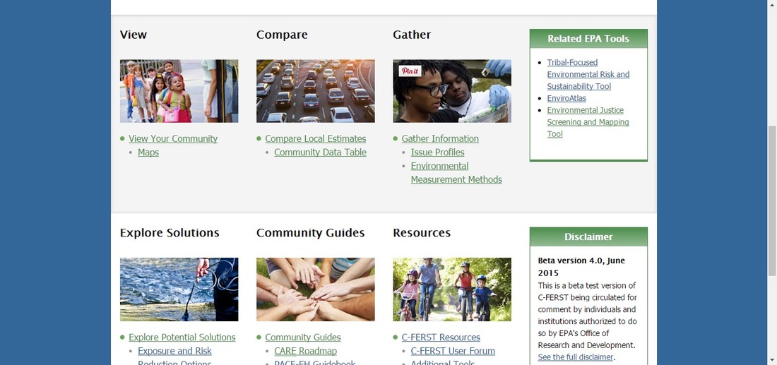
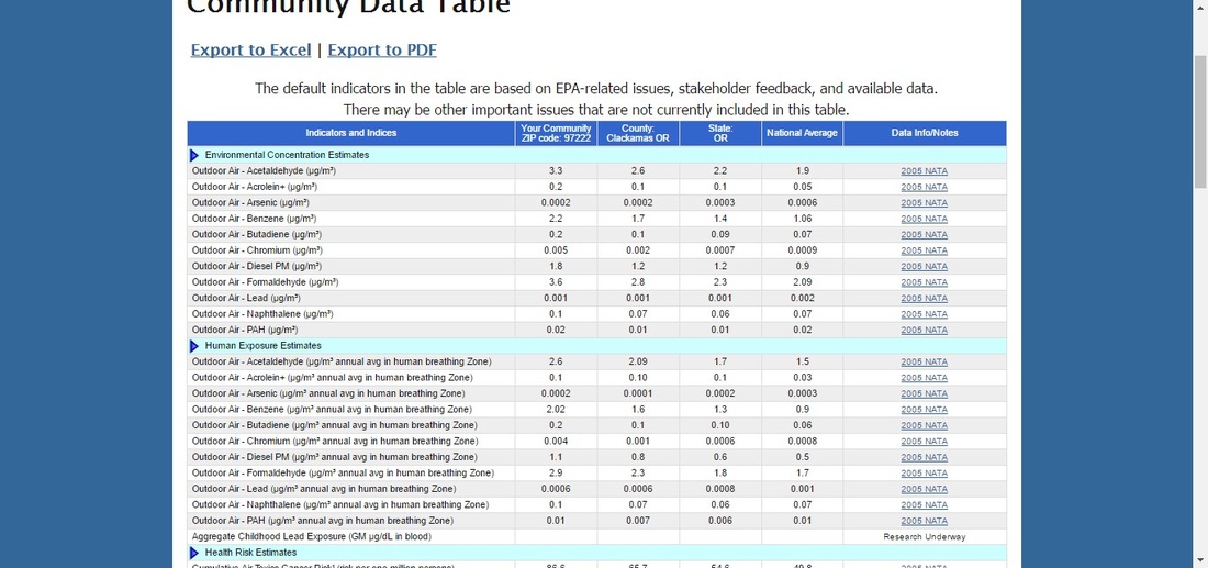
Written by Phil Paulson C-FERST stands for the Community Focused Exposure and Risk Screening Tool, which has been in beta-testing since the fall of 2013, and is projected be released in the Fall of 2016 or shortly thereafter. It’s part of a network of related mapping, data visualization and data portal applications in various states of testing by the EPA that include T-FERST, EJScreen, and EnviroAtlas. These tools serve as the backbone of the EPA’s push to provide spatial data about possible human and environmental toxic exposures to the communities where these exposures have, could and probably will occur, so that they can be more informed about their communities and take action to mitigate or eliminate threats to their health. The tool dashboard currently looks like this: The mapping application is the introduction to the rest of the data and research interface, and is built with almost rugged simplicity; all of the data that it displays is publically available, the map is built in ArcGIS Online (you can sign in to ArcGIS, and are required to do so in order to add additional layers) with a Bing base map, and the cartography of the provided layers is utilitarian. The layer names are fairly opaque unless you have a familiarity with environmental law and ArcGIS naming conventions, though there are plans to address this concern before the public release. The Compare Tool provides a generally comprehensive list of the health measures displayed on the map by the zipcode and then provides data for the county and state that contain that zipcode, and national average for comparison rates: The rest of the sections in the tool provide information (often in the form of links to websites) about how to collect additional data about the measures of environmental health and different programs that are available for technical and financial assistance in addressing these sources of environmental risk. Most of these sections also have Story Map examples of how to utilize and interpret the tool.
I began testing this tool as part of my Bachelor’s degree in 2013, and much of the structure that was in place at that time is still in place, but there has been additional information and explanation added about how to use each of the tools (largely through the Story Map examples). When we began the testing process, we were advised that this tool was intended for communities working with GIS and/or environmental science professionals. Given the layout and technical detail provided through the mapping interface and best practices research that is provided, I would say that this advice is sound. from the standpoint of a general user, the data is useful for starting a conversation, but requires significant GIS and scientific analysis in order to provide a concrete plan for action, likely through a local government.
1 Comment
Kyung Lee
6/3/2016 08:20:04 pm
Ah, the hard, dirty work of science! Do you know if this tool has increased in relevance and/or use in light of local airborne heavy metals and leaded school water?
Reply
Leave a Reply. |
AuthorBlog posts are written by students in the Interactive Map Design course at Portland Community College. Archives
June 2018
Categories |


 RSS Feed