|
Written by Kayla Tomlin Have you seen a UFO? And if you did, what would you do about it? MUFON (Mutual UFO Network) is a scientific research organization that conducts scientific investigation of UFO’s for the benefit of humanity. They host a clever map that shows UFO sightings from all over the world, and allows you to enter your own sighting along with supporting evidence like photos, drawings and videos. I spoke with Tom Bowden, the Oregon State Director of MUFON (Mutual UFO Network) to ask him a few questions about the interactive map and who created it. He said they hired an organization called UFO Stalker to make their map, and admitted that geolocating these anomalies can be problematic. Many people may not know their exact location during the sighting, much less the exact location of the UFO. If they don’t know what city they are in it could be recorded by county, state/region/province, or they may only know they saw a UFO in Paraguay! Here’s a shot of the map that has some fun interactive features that show the point data as UFO’s of various types (saucer, black triangle, or an alien face for alien encounters!) falling from the sky when you pan and zoom. There are popups that display a summary of the sighting, as well as a table summary below the map of the sightings within the view. 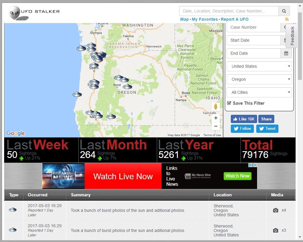  There is also a search feature that lets users search for sightings by date, location, or MUFON case number. I got ahold of the author of the map and his name is Douglas Bell, but he lets me call him Doug. Doug saw a “data source that was ripe for visualization” when he offered to create this map for MUFON, but Doug has admitted he has never actually seen a UFO himself. He appended the MUFON data to include additional statistics such as local weather conditions at the time of the sighting, and through his analysis he reports there are distinct patterns that have emerged. He said one clear trend is the fact that highest volume of UFO’s sightings occur on days when everyone is outside looking up on July 4th and January 1st.
Doug describes how he created the map using AngularJS and JQuery, Google Maps with custom overlays, and a Java API that serves the data to the presentation layer via Tomcat. Behind the scenes there are Java microservices that handle actions like data collection, correlation, and tweeting. His data sources come from a MySQL database, with local data stored on a Mongo database for caching and speed. Doug has created other interesting maps including one that geolocates IP addresses to aid police in locating stolen computers, a housing map that mines data from sources like Craigslist and Oodle allowing the user to search by amenities, as well as a garage sale and Wi-Fi hotspot locator for use on iPhone/Androids. If anybody could find aliens, it’s Doug. It’s just this type of inquisitive and talented mind that will make up the alien hunters of the future. These emerging UFO datasets could reveal the secrets that Giorgio Tsoukalos would kill for. Don’t forget to look up! http://www.mufon.com/live-ufo-map.html
4 Comments
Written by David Kelly I have two opinions regarding Web Coding:
With that, I offer a few tips on basic HTML5 syntax and some keyboard shortcuts that will make the struggle a little easier. And I highly recommend spending some time at https://www.w3schools.com/html/; this is where I learned most of what I will share. Organization: Web coding terms like tag, element, block, article, section, and span all refer to a “container” that can be empty, or have any number of “containers” inside. Commonly referred to as nesting, web page organization is essential to correctly display text and images, and can metaphorically be described as a sandwich, a set of space-saving Tupperware, or a topographical map. 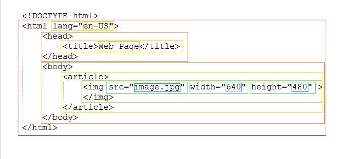 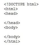 Where to start: The first thing is to create a file with the .html extension. I found Notepad++ to be very helpful because it recognizes web code file types, and colors the text according to purpose. The beginning of your code should:
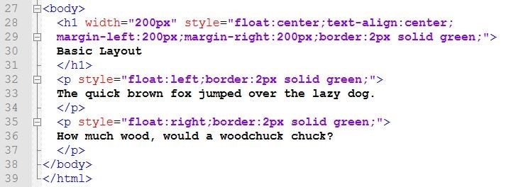
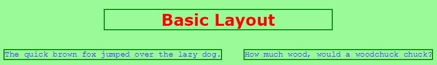
The <head> section: Metadata and references are in the <head> section. The code in the head section is not displayed in the browser window, but is used for recording information and characteristic presets that can be accessed by the writer and user, alike. An example of metadata follows: 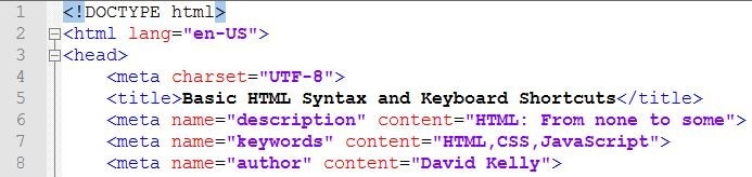 The <head> is also where “Internal” Cascading Style Sheets (CSS) code can be written for use by any of the webpage elements in the <body> section. You can predefine the text for headings, paragraphs, and links, as well as, the size, border, and spacing of your HTML containers by defining classes in a <style> section inside the <head>. All elements have default styles, so CSS in the head section is not needed for a page to display. 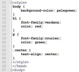 The <body> section: This is where all the visible pieces of your web code go. The <body> is described with a left-to-right, top-to-bottom method; that can be measured in units of pixels or percentage. There are a few ways to arrange the content of your webpage:
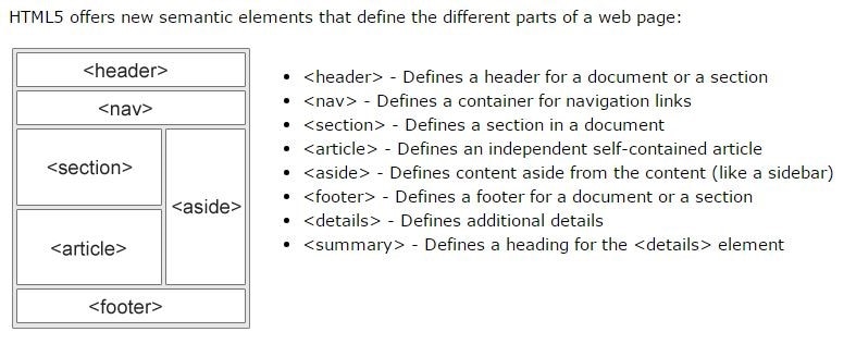 There are many layout templates available, from basic to complex, and in numerous themes. But you need to have a little experience to change the template’s contents and make it your own. It can get complicated very quickly, so I recommend starting simple. A good source for layout templates that use CSS is, again, w3schools: https://www.w3schools.com/w3css/w3css_templates.asp Basic Syntax: Now to some of the nitty gritty details of how each element can look. <tag attr1=”value” attr2=”value” style=”prop1,prop2:value;”>content</tag> Explanation: 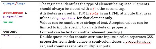 Here is a cheat sheet of HTML5 element tag names and descriptions: https://websitesetup.org/HTML5-cheat-sheet.pdf W3schools has a nice reference site for tag names, attributes, colors, and everything HTML: https://www.w3schools.com/tags/default.asp Keyboard Shortcuts: While working on web code, switching between windows and tabs is a constant, so here are a few shortcuts I used all the time: 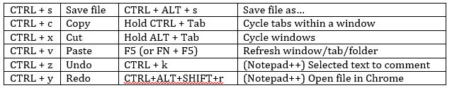 Here is a link for more keyboard shortcuts from w3schools:
https://www.w3schools.com/tags/ref_keyboardshortcuts.as Written by Sarah Dewees
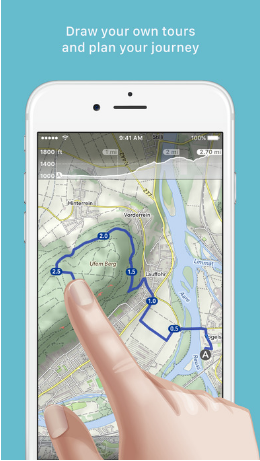
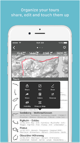
So I'm not a computer person and I don't know code, but I want to make maps that people can interact with. And so far my foray into web mapping has left me a bit lost. I need to know a new language or two ( Java script, css, html) and even some of the words that are in English don't make sense. There seem to be few programs out there to help us illiterate folks code, but you have to be able to get your data onto their server. There are so many file types available and at the same time so many that are unavailable. The questions I hope to answer for myself and graciously share with you are; which file type is best? and how to convert from one file type to another. Supported Web mapping file types: Below are a list of file types that I could upload to Carto, Mapbox, Google My Maps and ArcGIS online. There are probably more but this seemed like a good baseline. These are also all less code required sites.
After lots of looking there does not seem to be one universal file type with web mapping. I didn't really expect there to be, but wanted to check. GeoJSON seem to be pretty popular in web mapping since its already in Java Script and many of the web mapping libraries are in Java Script. Unfortunately, in my experience GeoJSON files gave me the most trouble to create. ArcMap only converts to .json files which give me an error in Mapbox (and possibly others) that I can't figure out how to fix it. So how do I get to the elusive GeoJSON.... Transforming one dataset into another - its magic! Without using code Unfortunately this does not work with raster data you must first convert to a vector format for uploading. Using Carto - Ok, so you can upload lots of different file types into Carto and then download (click on the dataset, then export) them as a .geojson or KML (also csv and shapefile). The only problem I found with this so far is that while your data is on Carto, unless you have a paid for account, the data is public. There doesn't seem to be a limit to how much data you can upload to Carto and you can delete it afterwards but if your data is sensitive this might not be the best plan. Using QGIS - Bring data into QGIS, right click on it and go to 'save as', then select geojson and make sure all parameters are appropriate and save where you want it. If you need to edit it convert after editing as QGIS cannot edit geojson. These are the only non-code methods that I have been able to find that work for me. Please share any methods you find or know of for file conversion! Written by Adrienne Spitzer At this point in our lives we all use some kind of mapping app on a daily basis. Most of the common apps require a Wi-Fi connection to provide accurate traffic data and give you real time turn by turn directions. I have encountered times on road trips and even around Portland where my app stops working because it loses connection and I am left to figure out directions without the help of Google Maps. So, I looked into GPS apps (not just for directions!) that work without internet access and have provided a summary of a few that I think look pretty cool. There are a lot of apps out there that work offline- this is just a summary of a few that are highly rated and seem pretty simple to use. **Disclaimer** I have not actually downloaded or tried any of these apps but I gathered information about them directly from the manufacturer’s website and from reviews by users online. HERE WeGo Rating: 4.5/5 stars Cost: free Compatibility: Requires iOS 9.0. Compatible with Android and iPhone/iPad. Best use: Getting around in foreign countries without internet connection.
Why you want it:
MapOut Rating: 4.5/5 stars Cost: $4.99 Compatibility: Require iOS 7 or later. Compatible with iPhone/iPad. Best use: Best offline mapping using OpenStreetMap.
Why you want it:
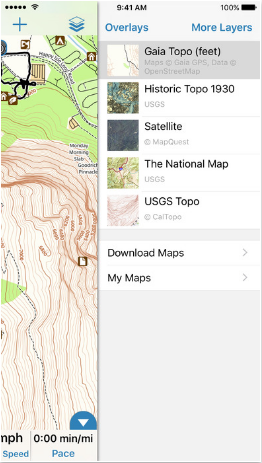
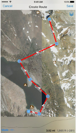
Gaia GPS Rating: 4.5/5 stars Cost: $19.99 Compatibility: Requires iOS 8 or later. Compatible iPhone/iPad and Android. Best use: Best outdoor mapping app for hikers, bikers, and hunters.
Why you want it:
References: http://www.cyclingabout.com/best-offline-gps-apps-smartphone-navigation-apps/ https://itunes.apple.com/us/app/here-wego-city-navigation-offline-maps/id955837609?mt=8 https://here.com/en/products-services/consumer-app/here-wego-app https://itunes.apple.com/ch/app/mapout/id477094081?l=en&mt=8 http://www.mapout.ch/en/ Written by Erin Miller
In the age of ever expanding Internet use, data collection (open source or private) and subsequent map visualizations via Internet mapping technologies, such as Google, the concept of ethics in web mapping applications becomes vitally important in protecting the integrity of online cartography. A good starting point for this discussion is the Code of Ethics provided by the GIS Certification Institute (1). This document describes some basic ethical guidelines to consider as a GIS professional. The most important of which is the understanding of how our map products may directly impact society and individuals. Large scale Internet use allows maps and data to spread like wildfire across the entire world in a matter of seconds. A poorly designed online map, or one that intentionally or unintentionally leaves out data, made public can have unintended consequences if misinterpreted or misused. A new dilemma arises from the proliferation of online mapping platforms, especially open source, where cartographic novices can add to the wealth of information on the web. OpenStreetMap allowed anyone in the world to add their local spatial information. The ethical question involved with this is who is responsible for the resulting map product (2)? How is the map going to be used? What are the motivations of the users adding (or subtracting) data to these open source maps? A final consideration in the use of interactive web mapping is the addition of non-spatial data to online maps. When using Google Earth or Google Maps online users can input photos and comments directly into their maps. The ethical concern with this deals with copyright protection and the quality of the comments being added as information to the maps (3). Another concern involves the identification information displayed in Street View within Google Earth. An unsuspecting person photographed as the Google team drives by is now identified and their privacy unprotected. As useful and convenient as Google Maps and Google Earth is, are we unintentionally giving up some of our basic rights as a society? How much information is too much information? My own thoughts on the subject deal mostly with the implications of online mapping on societies and how the information presented in online maps can be grossly misused by corporations, governments, and others. Once we publish a map online we don’t really have much control in how it is interpreted by other users of the map (or subsequently manipulated for other purposes). If at some point we end up working for a corporation that utilizes online web mapping technologies, are we providing skewed visualizations that favor a particular viewpoint. I feel as future GIS professionals we have an obligation to really consider and think about our online maps (or any GIS product for that matter) and maintain as much professional integrity in our final products as we can.
Written by Ian Amitin
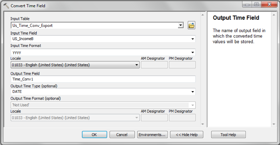
I woke up and did what I assume most Americans do to start the day; I checked my phone. I’m not proud of this habit. The routine of checking my phone involves a look at the latest news from NPR. My eyes opened just a little bit wider when I read the headline of the second article down: “Maps Show A Dramatic Rise In Health Insurance Coverage Under ACA.” Ah sweet, a temporal map! thought this nerd, as I examined the article glowing in my face. Indeed, it was a temporal map of the rate of insured per capita by county of the United States. This find was particularly timely because I had been looking for interesting temporal web maps for a couple of days with little to show for it. This map was simple. It had a time bar, and told a simple story. Perfect for mass consumption. I need to make one. So I researched… … And researched… … And then tried an exercise. Finally feeling confident, I decided to try to make the simplest of time enabled web maps... and got nowhere. I was stuck in a cycle of google searches, failed ArcMap table joins, AGOL not giving me an option to enable time functionality, and swearing to myself for days. In cases such as the one I found myself in, I have a method to get myself out. I go to the boxing gym, punch things, get punched, feel better, then go back to work the next morning. Low and behold it worked. I guess my sparring partner knocked some sense into me and I recognized that I was going about my table join the wrong way. I needed to perform a one-to-many join, instead of the standard table joins and appends that proved worthless in this situation. I ended up using the Make Query Table tool to complete a Join of US median income data by year with a simple polygon shapefile of the United States. 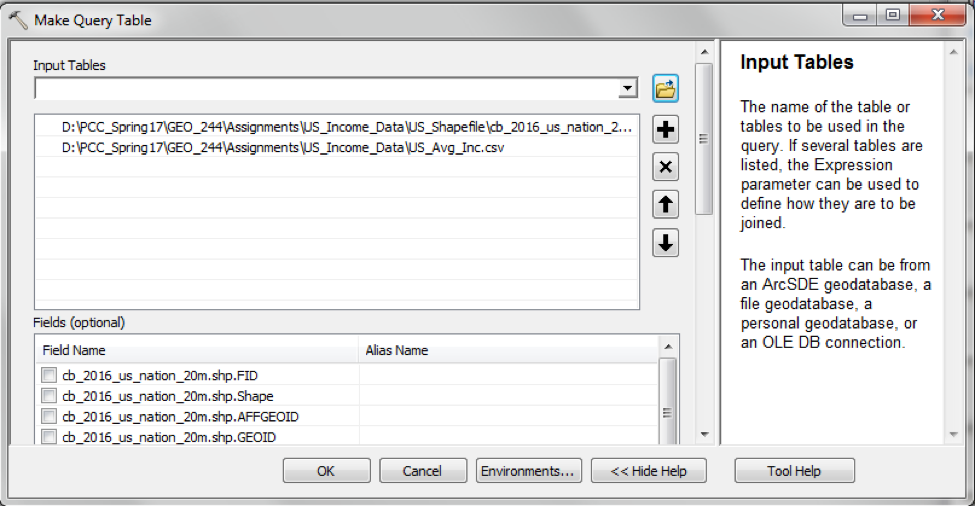
Although the join seemed to work, the names of my output attribute table fields had changed. The field that used to be called ‘Date_’ was now called ‘IncomeB’… Why, Arc, why?!
I knew from my research that I had to enable time on my layer by opening the layer properties and navigating to the ‘Time’ tab, then clicking ‘enable time on this layer’. 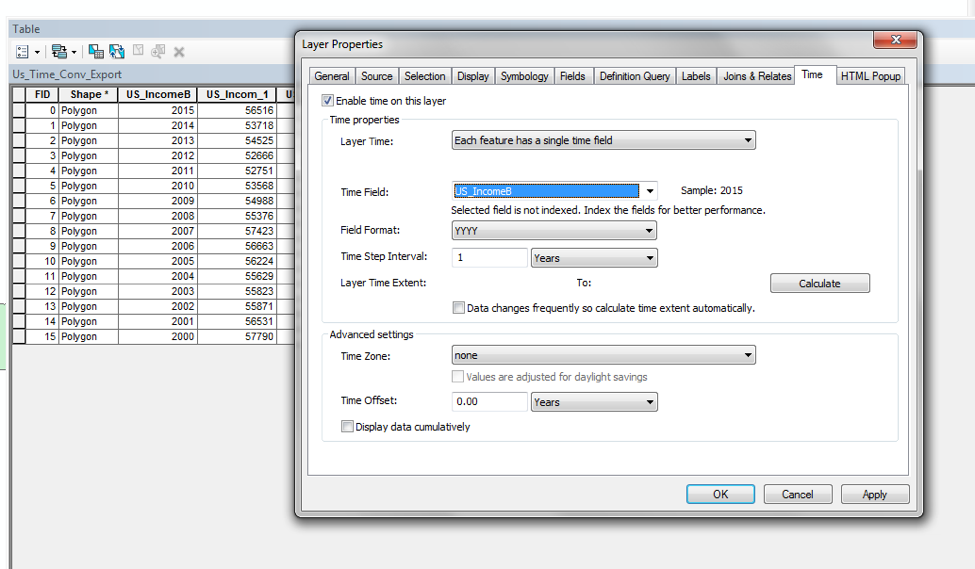
As it turns out, this step is only important for making a time-enabled map within ArcMap. What was truly important was formatting my time field so that ArcGIS Online can understand that this layer contains time data. To do this, I used the Convert Time Field tool.
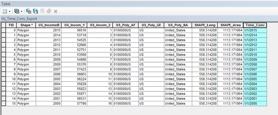
This gave me a new field that I named ‘Time_Conv’.
With my data now formatted to be recognized in AGOL as containing time, I exported my data into a new folder and then compressed that folder, because AGOL can only upload shapefiles in .zip folders.
Finally, I was ready to make my temporal map in ArcGIS Online. I started by uploading my data into the ‘My Contents’ section as a Hosted Feature Layer. It was very important for me to upload data as a Hosted Feature Layer, otherwise AGOL would not recognize that my data contained a time attribute. We are able to do this because PCC now has hosting privileges. 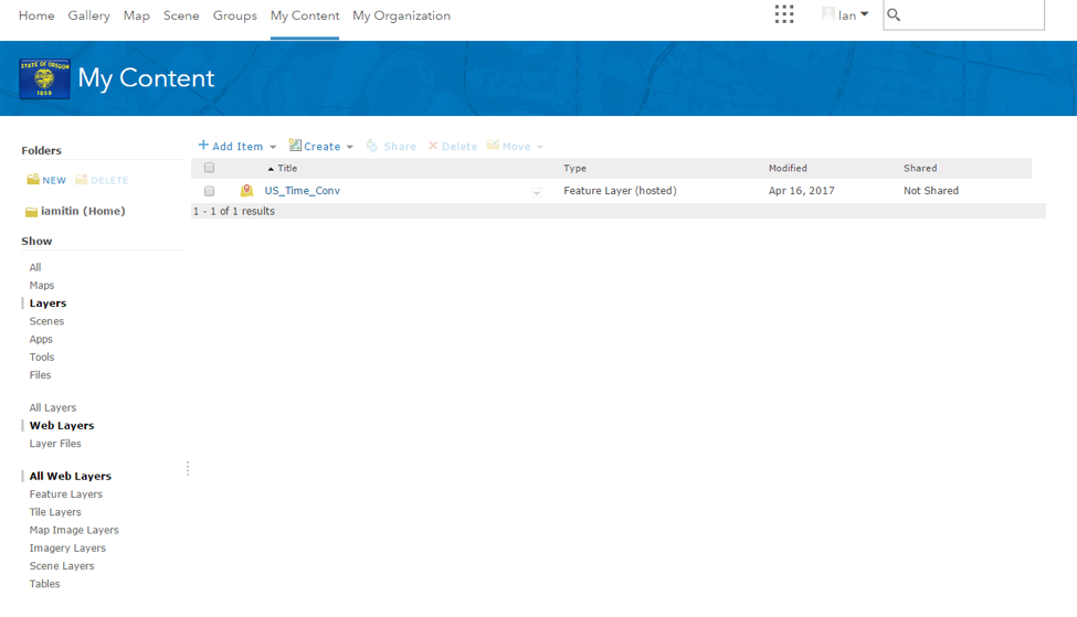
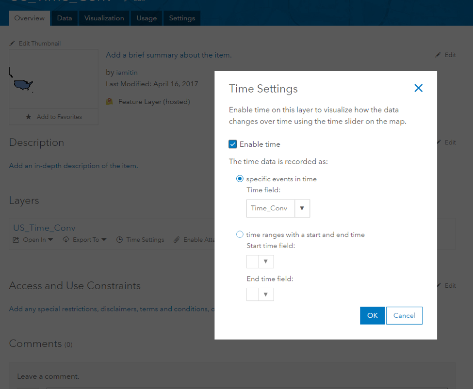
With my data hosted in AGOL, I clicked on my file name and enabled my time settings.
After time settings are set, making a map in AGOL was easy and intuitive. I modified the thematic characteristics of my map by clicking Details > Change Style, and then selecting an attribute and display theme. I selected my attribute for Annual Median Income (‘income1’) and made a simple 5-class choropleth map using natural breaks to classify significant changes year over year.
At the bottom of my map I found a time bar and small button to the right that will allowed me to configure my time bar settings. 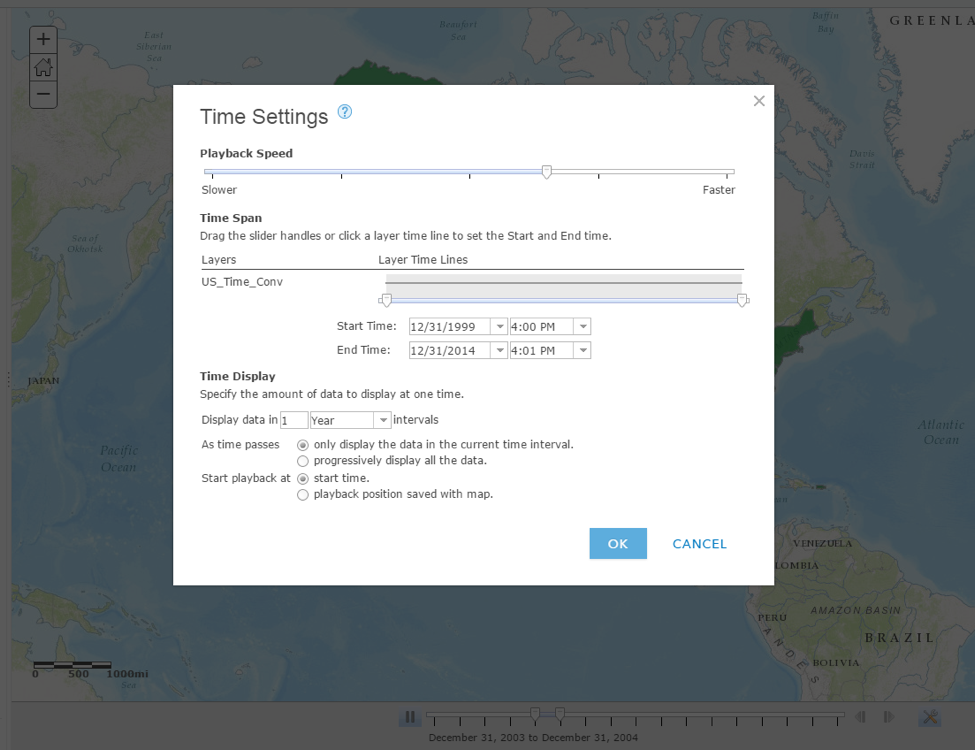
While less than great, I had finally built a temporal web map! I high-fived everyone in the tutoring lab.
My experience in making the simplest of temporal web maps was frustrating, but like trying most GIS tasks for the first time, now that I have made it work once, I feel much more optimistic about making better maps in the future. My first temporal web map. Open Source Interactive Mapping: A Rudimentary Introduction to the QGIS2WEB Plugin for Quantum GIS4/14/2017 Written by Eddie Curran QGIS2Web is a QGIS plugin which allows the user to export a map created in QGIS to an openlayer or leaflet format webmap. The following is a painfully simplistic tutorial in which the user creates a simple interactive map in QGIS, exports it to webmap format, and opens it in a web browser. First, (after opening the latest version of QGIS) install the QGIS2Web plugin from the "plugins" menu. An icon appears on the taskbar, one icon to the right of the "python" icon. 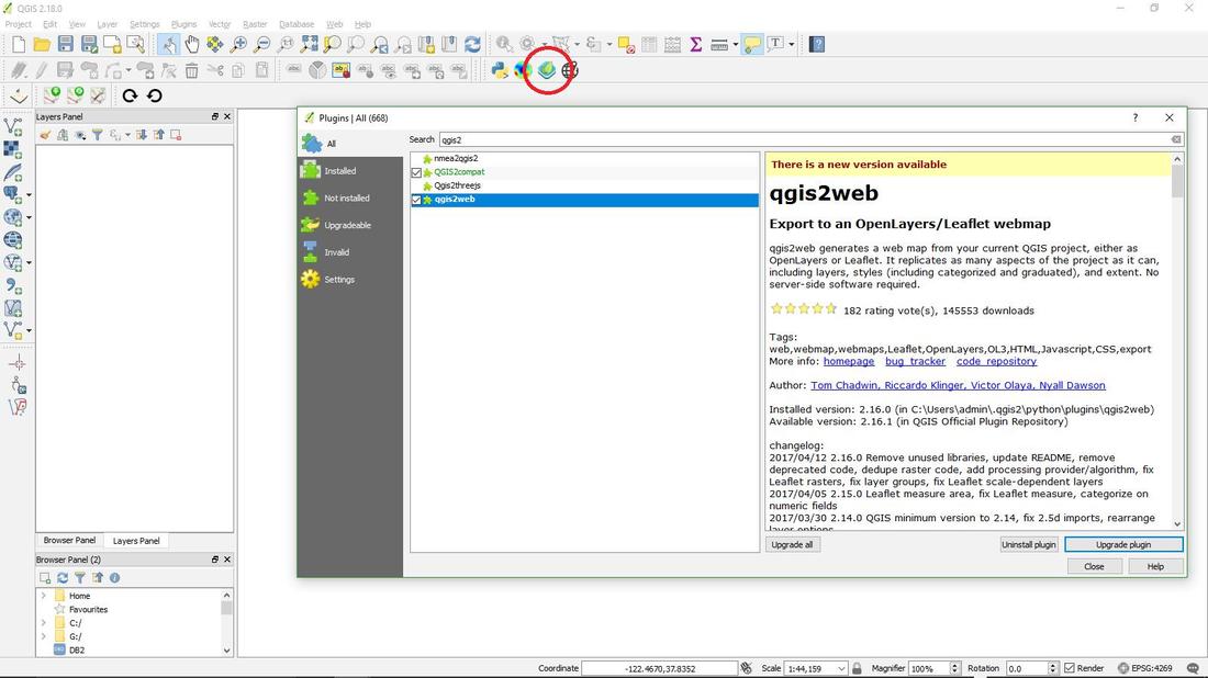 Import layers to QGIS: Select the "add vector layer tab" in "layer" mode and browse for layers. In this case, a Portland neighborhoods layer and major river layer. 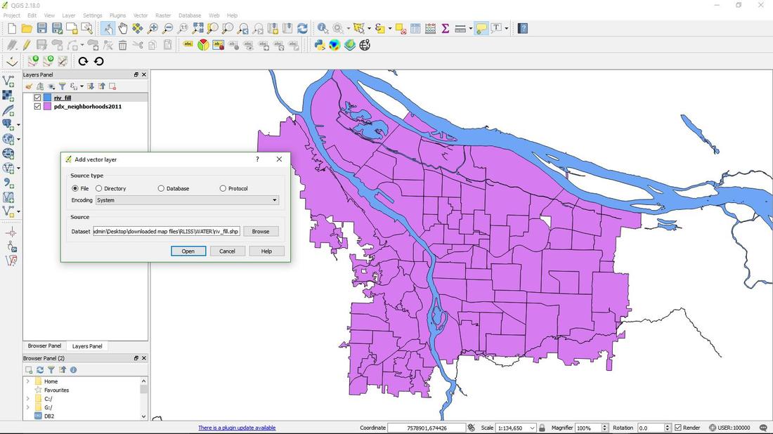 The coordinate system for web mapping in QGIS is EPSG 4326, but this does not reliably work with QGIS2WEB. However, a default coordinate system, called the "User Defined Coordinate System" almost always works when exporting a map with the Q2W plugin. To make basic alterations to the imported layers, double click on their labels in the table of contents, or right click – properties. In this example, "style" is chosen and the neighborhoods are classified using a random color ramp. 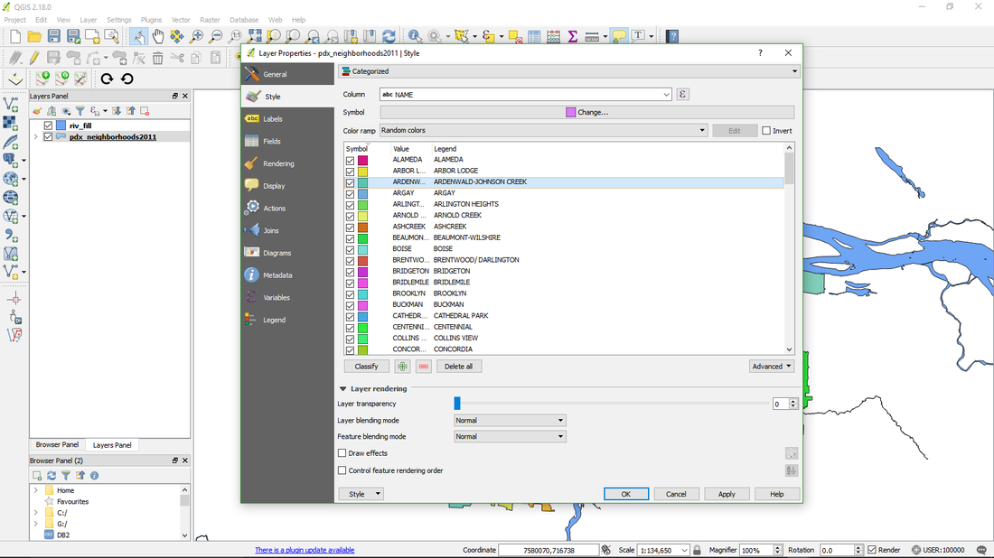 Right clicking on the layer in the table of contents and selecting "Set Layer CRS" will set the coordinate system: one can also click on the "General" tab in the Properties window or find the "Set CRS of Layers" menu item under the "Layers" menu in the main toolbar. Once the layers are ready, just click on the QGIS2Web plugin button and if all goes well a preview window appears with the layers displayed in it: 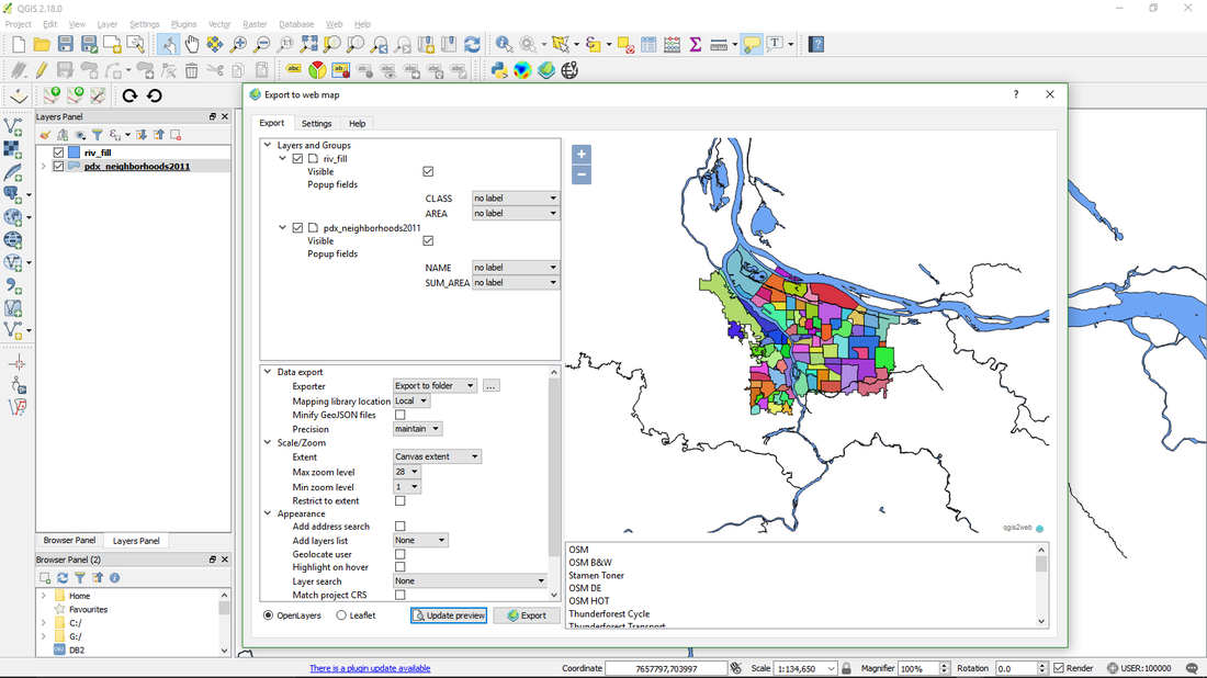 Here you may choose from a variety of menu items to do some basic tweaking of the map. For example, how attribute values appear when counties are clicked on the map, the default scale, whether OpenLayers or Leaflet format, configuration of a search bar, etc. (the actual code is available for alteration once the map has been exported). If the layers do not appear at this point it is usually because there's a problem with the coordinate system/projection: if one layer is in the wrong CRS then none of the layers will appear. This problem can usually be solved by going back to QGIS and changing the CRS (Layer- Set CRS of Layer(s) or Ctrl-Shift-C) to the "User Defined Coordinate System": 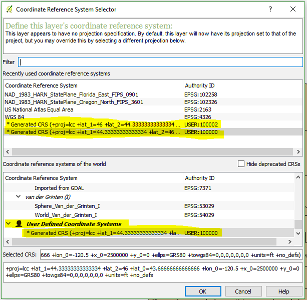 In the lower right corner of the preview window one may choose from a list of basemaps: Selected here is a basic OSM street map. 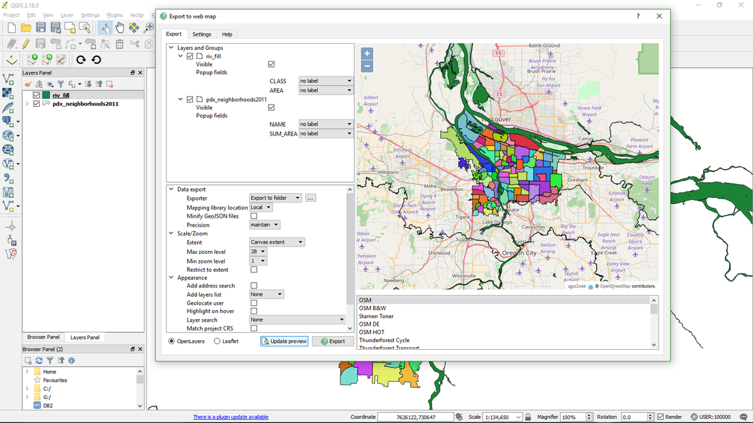 This is a good place to troubleshoot the Coordinate Reference System (CRS) : if the basemap does not line up correctly the layer's CRS need to be changed. (Typically if there is a projection issue the layers won't open up in the preview window at all, but this is another opportunity to make sure they're lined up properly). In the preview window it is possible to see how the map will behave once it is opened up and manipulated in a browser: clicking on the map calls up attributes, zoom and search functions work just as they would when the map goes "live". 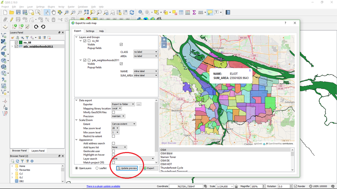 At this step in the process one may go back to QGIS to add and alter layers, or change any of the settings in the preview window. Hitting the "update preview" tab refreshes the now interactive map prior to exporting. Before exporting to webmap, click on Data Export / Browse and decide where to save the map: this determines where the html, css, java, etc. files will be stored: 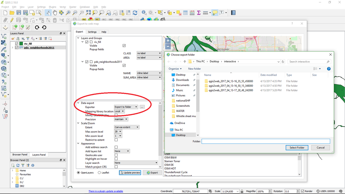 To export, hit the Export button. Immediately after exporting the map, it appears in the default web browser, with all its functionality (hopefully) ready for testing. 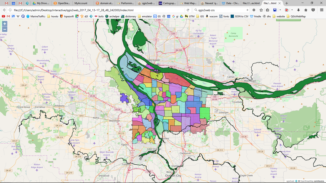 Subsequent exports will appear in adjoining browser tabs, which is useful when altering code and comparing version. To open up the new web map's files and tweak the code, navigate to the folder where the map is stored. 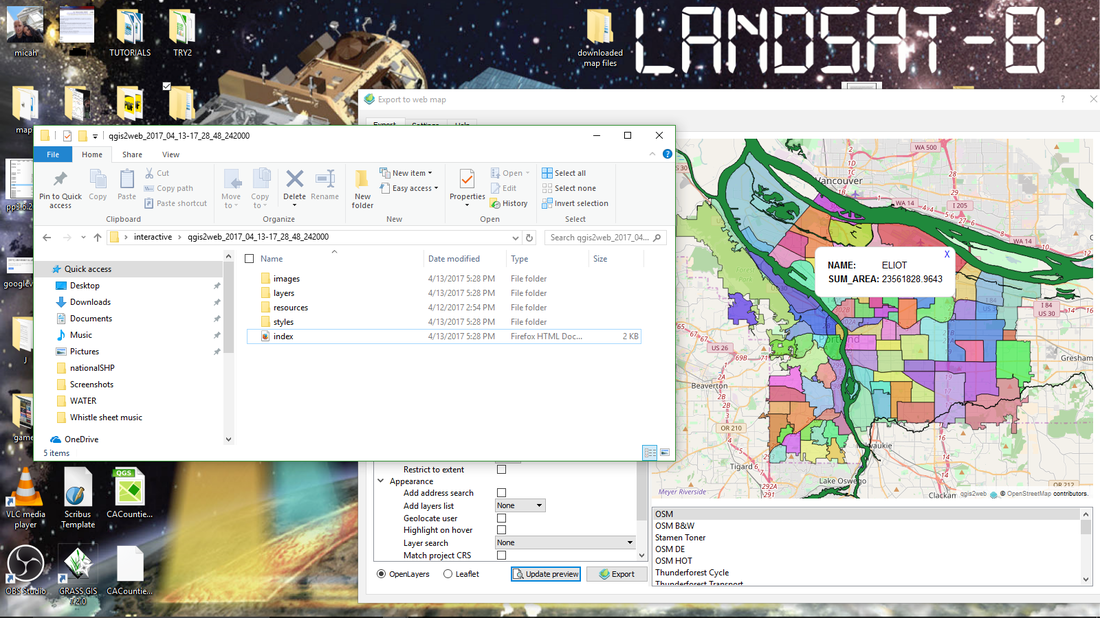 Qgis2Map organizes the files into folders in a folder whose name reflects the time and date of its creation: this is useful as it's common to do multiple exports, which are by default stored in the chosen export folder. Open up .html .css, .js, etc. files in a text editor to work on the webmap's code, save your alterations then refresh the browser window to check on your changes. The map is ready to be published online. 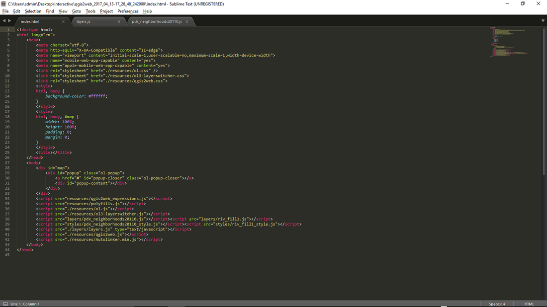 Advisory: It is important to update QGIS to the latest version (currently 18.6) and to update the GGIS2WEB plugin whenever neccesary, as both QGIS and its various plugins are in a constant state of development, updates are released periodically and by default not updated automatically. It is entirely possible that a "bug" which might hamper performance in one version has been exteminated in an updated version. QGIS update notifications appear upon opening the application, and plugin update notifications are available under the "plugin" dropdown menu. Support: The GIS Stack Exchange https://gis.stackexchange.com/ has active GGIS2WEB discussion threads, to which the developers contribute from time to time. Questions which are appropriately pithy and non redundant (meaning, don't be too wordy and make sure to search the website to see if your question has already been answered) are often answered with in a day or two. Written by Michael McDermott 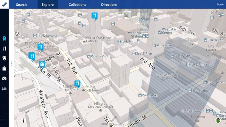 Formally known as Nokia, HERE maps is a web mapping platform similar to Google Maps or Apple Maps. HERE maps was recently purchased by the huge Auto Companies, AUDI AG, BMW, and Daimler AG for 3 billion dollars. These large auto industry leaders believe HERE maps will be the Vital Technology for self-driving cars all based off of the HERE Location Cloud. HERE Maps goal is to become “an open location platform accessible to all customers-within and outside the automotive industry- who seek to leverage the power of location in their businesses.” I believe HERE maps will take the place of Google and Apple maps very soon. HERE is strictly focused on the mapping aspect unlike Google and Apple who focus on a wide verity of other services. Here are some awesome features HERE maps has that other navigation mapping platforms do not. Maps in 196 countries Public Transit maps Over 90,000 building maps Works online and offline Amazing real time traffic info HERE maps has some of the best traffic Information out of all other navigation platforms. There is a dedicated team working 24/7 to gather and update traffic information. HERE Maps traffic team can even use verified Twitter feeds and police reports to make sure traffic information is useful. The Map devices also have the ability to Connect or talk with other devices or cars using HERE maps technology. Here’s how the company website puts it… “Say there was a dangerous pothole on a busy section of road; data could be crowdsourced from cars via the cloud in the area to update the HD maps of cars approaching this road.” The cars will also talk to each other if there is traffic or an accident. Over all this new technology of Maps talking to each other and updating 24/7 will make your commute much safer and faster. With more and more cars using HERE maps the Software will get better and this technology of cars connecting with each other will be a huge factor contributing to the autonomous cars safety. 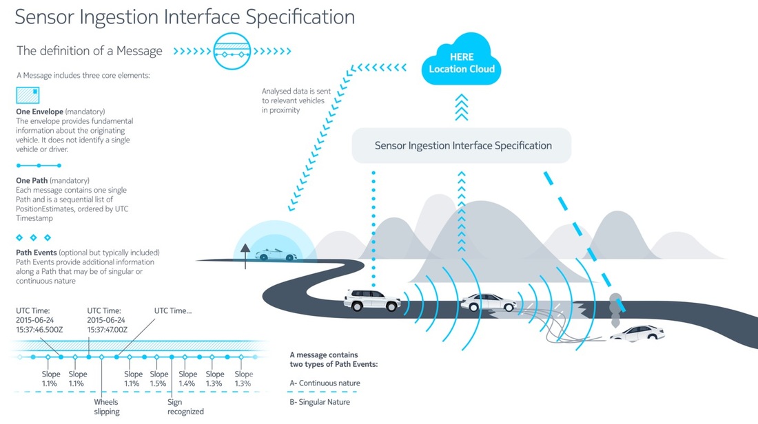 Another Feature HERE maps has, is the ability to work off line. I know I could have used that when traveling in another country when there’s no cell service. HERE Maps gives you the option to save the interactive maps directly on a device and then use them for navigation offline. 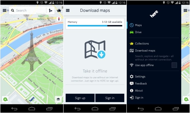 Unlike Google maps, HERE maps give you options about how you want to make your route. You can say you want the fastest way possible, or you can say that you want the most scenic comfortable speed route.
HERE Maps still isn’t perfect, the company doesn’t have the huge databases as Google, but with the new Auto industry investors, and with time this company will soon become the number one used interactive map for navigation and businesses because of their dedication to collection real-time Map data through the HERE Location Cloud. Written by Michael McGiboney 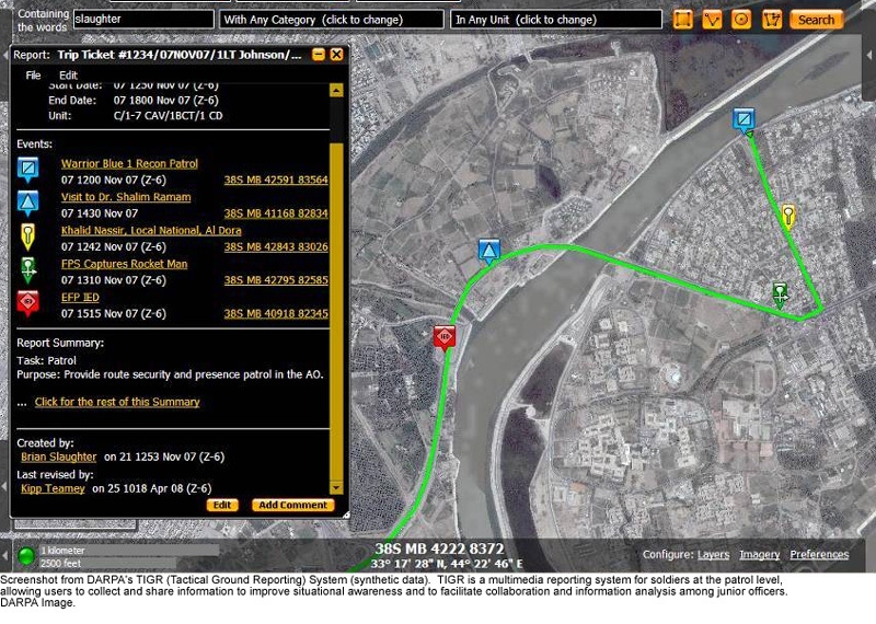 My personal experience My first exposure to interactive mapping was TIGR, the Tactical Ground Reporting System used by the military. During my 6 months of training at the US Intelligence School in Ft. Huachuca, AZ, I had been trained on several intelligence analysis programs, including GIS, but it wasn’t until I was actually in Iraq that we got the first roll-out of TIGR. It was an instant hit. Most soldiers in military intelligence are at the brigade, division and corp level. For every analyst in Iraq or Afghanistan, there are 20 stateside, for every 1 on a FOB, there were 10 in Baghdad at what we called ‘Camp Cupcake’. For every 1 that was embedded in a scout or infantry company there were 3 that stayed on the FOB. I was one of those that was in a COIST, Company Intelligence Support Team, so our GIS toughbooks were of no use to me in the heat, dust and chaos of being on patrol or a high-value targeting mission. My unit 3-1 Cavalry was a scout/recon squadron assigned to Wasit Province, SE of Baghdad. My intel section, 6 soldiers, was responsible for the acquisition, analysis, assessment and dissemination of intel within our area of operations. Our primary tool was DCGS-A, a platform that integrated several intelligence analysis tools, one of which was GIS. However for our work in the field ‘outside the wire’, in the heat, dust, cramped spaces of vehicles, we used TIGR. It was fast, simple and intuitive and it would show what someone else had uploaded in real time, we all could see what was going on in our area of operations, with detailed info and images. 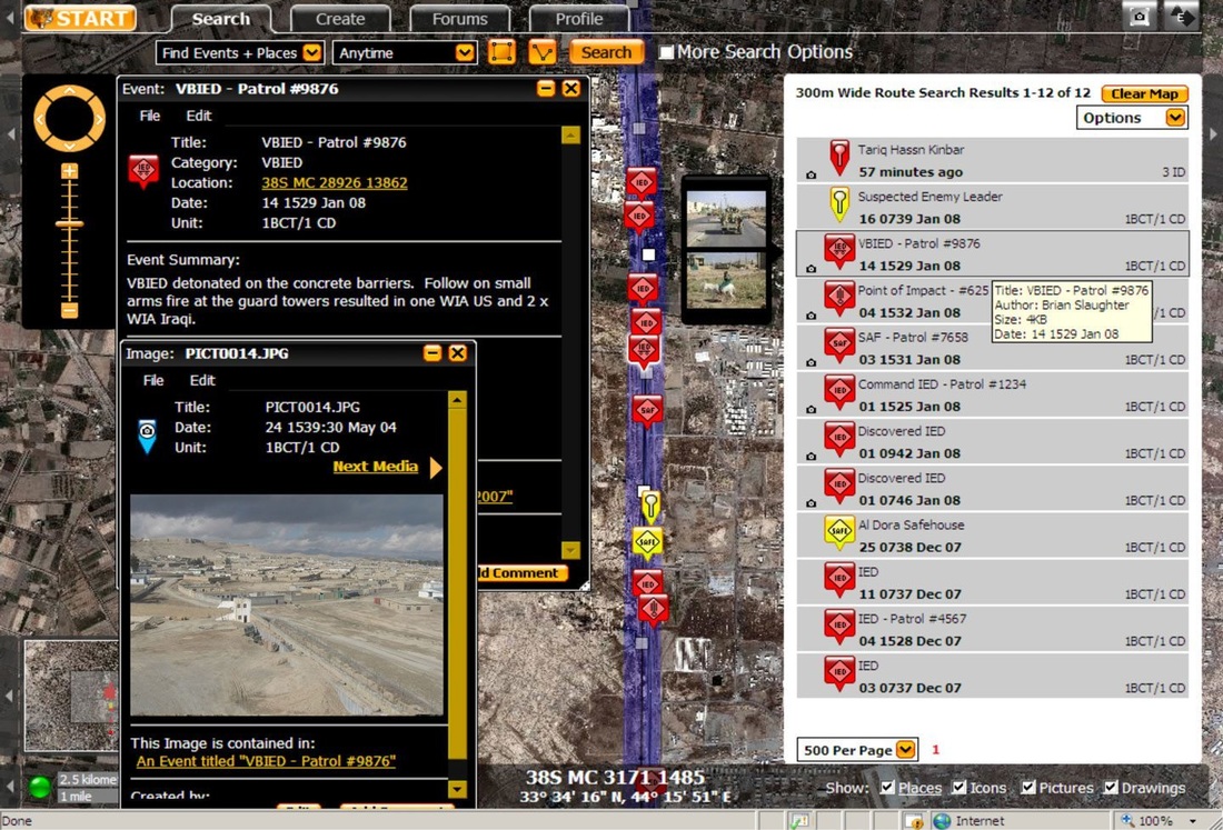 Background on TIGR Based on feedback from the intelligence and special operations community, DARPA developed a cloud-based intelligence reporting system in 2007 that could be used in the field and required minimal support. It has since been expanded to an app that can be used on military issued smart phones and tablets. Unlike GIS, which the intel community in higher echelons relies on heavily, TIGR is an easy to use, graphics oriented intelligence reporting program and app that allows soldiers to report information into a cloud in near real time with simple intuitive controls. General Dynamics explains further: “TIGR is an information-centric solution that empowers users to collect, share and analyze data using a Google Earth like interface backed by network distribution that is resilient to the tactical network challenges. It was developed in line with what Soldiers operating at Company and below needed to increase combat effectiveness across the full spectrum of operations. TIGR breaks from the traditional hierarchical, bottom-up filtered information flow of reporting, and instead builds on the successes of direct peer-to-peer collaboration. Its collaborative environment provides a unique multimedia solution using graphics, high resolution imagery, line of sight tools, and a searchable database to support the full spectrum of operations (plan, prepare, execute and assess). TIGR assists soldiers in planning and execution by providing:" The Army culled several redundant intel and mapping systems recently, but TIGR was one that stayed in the system. 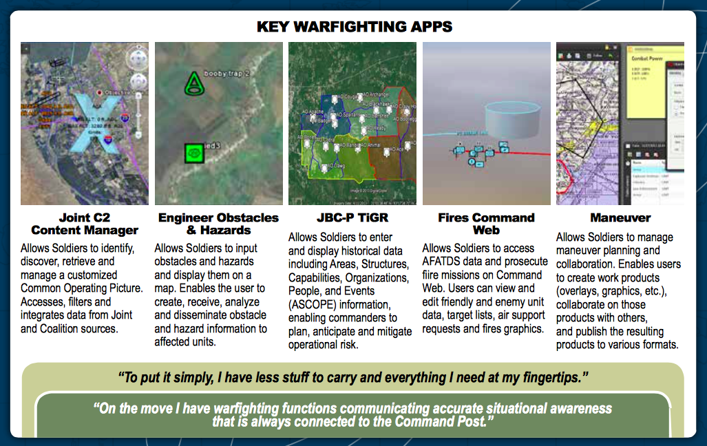 Combat functionality Real time essential information would go out over the radio network, but immediate post event intel reporting, with more detail and with pictures was possible with TIGR. Analysts on the FOB would see it instantly and begin deeper analysis and with a better picture could potentially use drone assets to help us more effectively. Even someone at the Pentagon could see what we were reporting instantly and in some cases like raids on high-value targets, this in fact happened. Sometimes with the madness of an operation and hectic radio chatter and incomplete intel over phone calls and chatroom exchanges between intelligence analysts hundreds and sometimes thousands of miles apart, a quickly uploaded SITREP or SPOT report could clarify the picture instantly. On the ground if a patrol was forced to take an unplanned route on-the-fly, TIGR could be searched with customizable parameters, for example you could search IED or other hostile events on a route, 200 meters wide, during a specific time frame. This type of instant access to relevant intel would be impossible with GIS.  While TIGR cannot replace the BATS/HIIDES biometric toolkits and databases or the analytical power of GIS, it fills a much needed role on the tactical level. We even trained scouts in our unit who had no prior training on intel systems, in a matter of days and it allowed them to post incident reports when there were no intel assets embedded in their patrol. If we weren’t with a patrol, then normally potentially time sensitive intel would not be known to the intel team until after their return and we debriefed them, but with TIGR we could get it in near real time. More than a few times a photo was posted through TIGR of a vehicle that fit the description of a BOLO and we were able to push UAV assets to the location with 15 minutes and acquire the vehicle. It isn’t the prettiest in the world, having a very Google look to it, but it is functional and reliable and in these types of situations, you don’t have time to worry about aesthetics. IT has been 6 years now since I used TIGR and the system has no doubt been upgraded, but I will never forget the powerful advantage it gave us in battling a determined and resourceful foe. Of all the advantages our weapons systems and training gave us, the power of superior knowledge, through actionable intelligence was possible the biggest game changer. 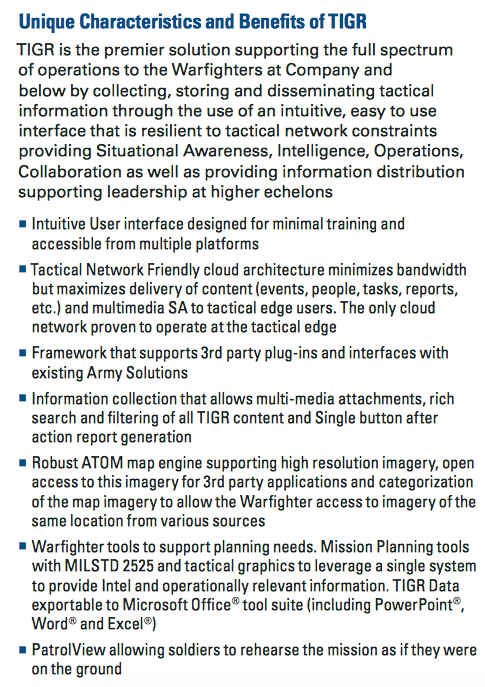 In hostile environments where you are running on adrenaline, constantly moving and needing to be aware of a hundred things at once, a simple user friendly intel collection application allows you to capture events that otherwise would be inaccurately reported hours later.  Written by Robert Mannering Inevitably, any history of an Empire has to fundamentally contain a history of the people within that Empire and how the subjects were managed. Increasingly, the history of cartography as a field has developed to explain the identity of Empires; and the study of systems of management and control has led to a better understanding of how early modern societies worked and what life was like within them. At http://downsurvey.tcd.ie, Trinity College in Ireland has georeferenced an incredible amount of data from 17th Century post-Tudor England and displayed the results in an incredible series of webmaps that bring to life a fascinating GIS project from the 1650s. But before getting into that, it’s worth considering what led to the historic survey in the first place over a couple of paragraphs of “pub history”. As is the case with most islands, the earliest patterns of urban development in Irish history can be observed along the coastline. While the traditional Gaelic clans and tribes kept to forested inland regions, Ireland’s Viking cities played host to an ever changing cast of invaders and settlers beginning in the 8th Century. This culminated in the Norman conquest of England in 1066 which soon led to a permanent Anglo-Norman settlement in Ireland. Generations of trade, inter-marriage and cross cultural assimilation between the ‘Old Irish’ Gaels and the ‘New Irish’ Normans gradually created an Irish-Norman identity unique to that of their distant cousins in England. Land hereditary practices, clan-based political systems and religious ceremonial procedures created a new Norman identity. However, crucially, the character of this identity remained loyal to an English crown that content to allow the New Irish to administrate the island in their name. Although this uneasy set-up waxed and waned over time, it nonetheless persisted until the English Reformation. The establishment of a Protestant Church of England by Henry VIII triggered a century of warfare over the English throne and the religious identity of the British Isles. Eventually, following the collapse of the last of Irish military opposition to English rule in the mid 1600s, the remaining Norman lords fled to France and the securement of the English Crown in Ireland was completed in 1652 with the passage of The Act for the Settlement of Ireland by British parliament.. The vacancy left from Norman landowners who had left, combined with the urgent need for loyal landowners to take their place, led to a systematic expulsion of ‘Old Irish’ and ‘New Irish’ from their land and pushed their presence to the barren reaches on the west of the island. In their place, land was gifted out to loyal English soldiers and noblemen. The complete resettlement of the island in turn brought with it a completely new system of management leading to the British Empire conducting possibly the first GIS project on a national scale to map and record the scale of land ownership change that had taken place over the previous decades. This soon became a trend, and into the modern era, Ireland became the subject of some of the most rigorous cartographic practices in the world at the behest of an Empire desperate to control and manage some of its most difficult possessions. Today, Trinity College’s webmaps detail not only the scope and depth of Irish Ordinance Surveys across the centuries (including a groundbreaking 20 year survey in 1824 that produced maps for the whole island at a 6 inch scale of resolution), but also create an interactive archive that shows on a modern web map of Ireland where historic land parcels were located and tied to the details of the title holders who owned them. There are two main components to the website. The first is a digital series of all of the maps originally created for the crown which can be panned and zoomed across. 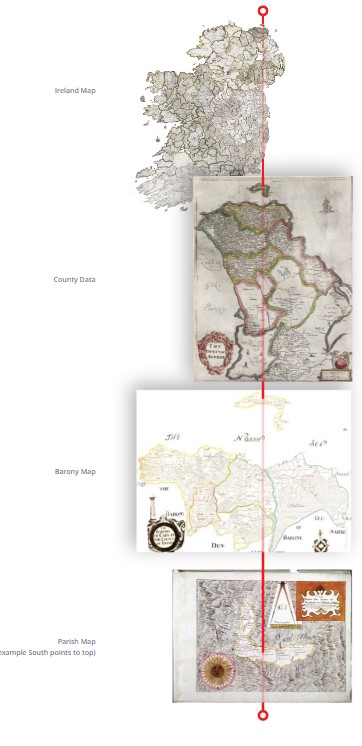 The above graphic shows the 4 levels of scale that the Down Survey created in 1641. Starting with an overall map of the Island, surveyors then made sub division maps for each county, baronies within each county and parishes within each barony. The second aspect of the site is a webmap that has all of the archived Down Survey information geo referenced to open streetmaps. This map can be queried for entries in the original survey and it will deliver the results in their modern location. 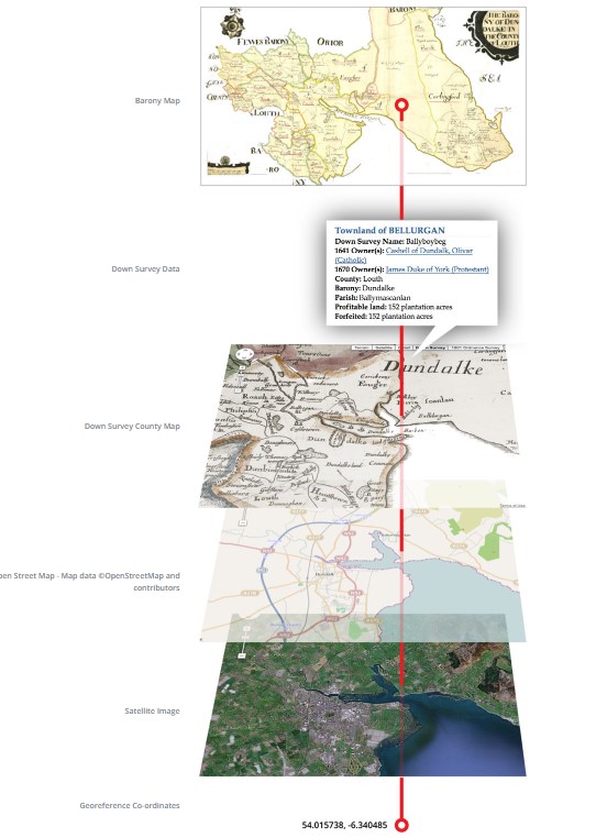 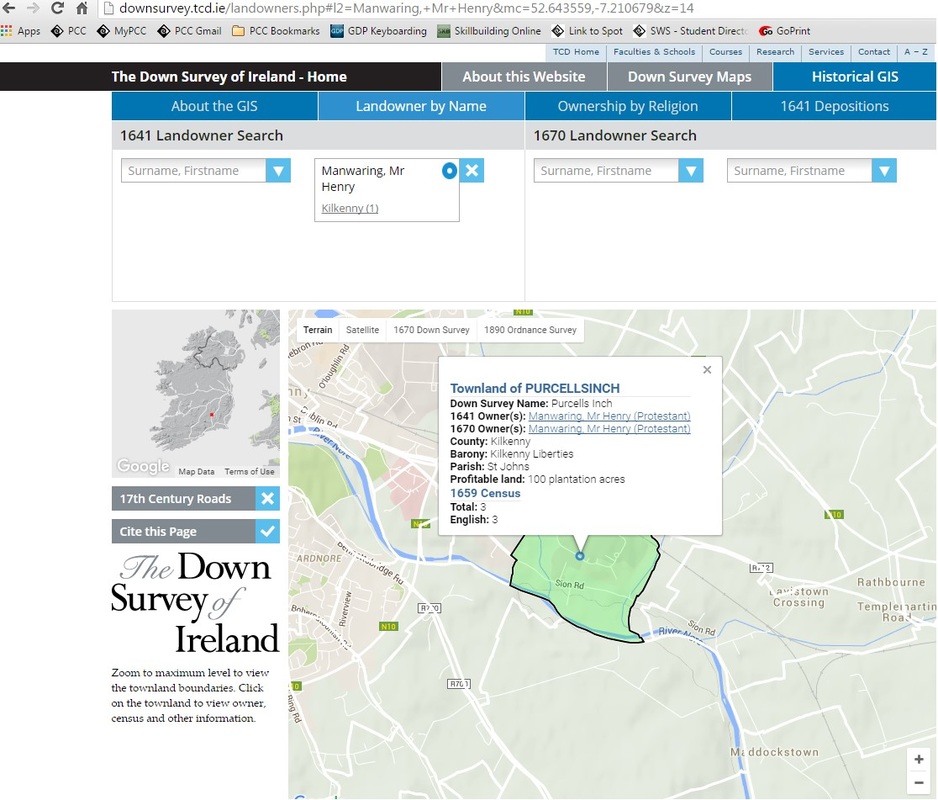 He’s named like my name! A couple of other points of analysis are on the site too, such as a 17th century crime map based on archived court depositions as well as a comparison of landownership between catholics and protestants, pre and post Oliver Cromwell: 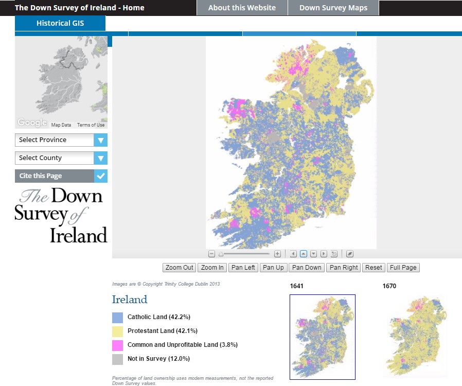 Spatial evidence of Oliver Cromwell not being a celebrated figure in Ireland.
So, there it is. Historical cartography. Pretty nifty. There’s a huge archive of geo-referenced historical maps from across the world at http://www.davidrumsey.com/. Also, http://www.washmapsociety.org/ is a historic cartographic society that publishes a quarterly journal a lot of historical aspects of maps and how they were built and used across the ages. If nothing else, it’s probably a good topic of conversation during a job interview. Hope you guys are into it! |
AuthorBlog posts are written by students in the Interactive Map Design course at Portland Community College. Archives
June 2018
Categories |

 RSS Feed